Setting Up Elasticsearch on Linux Ubuntu

Elasticsearch is a lightning-fast and highly scalable search engine built on top of Apache Lucene. In this article, we’re going to see how we can quickly set it up on an Ubuntu Linux environment (using Ubuntu 16.10 here) to be able to play around with it. We do not cover configuring Elasticsearch or setting up a cluster. To set up Elasticsearch on Windows, see “Setting Up Elasticsearch and Kibana on Windows” instead.

Before we can set up Elasticsearch itself, we need Java. We can follow these instructions to set up Java on Ubuntu. Before proceeding, verify that the JAVA_HOME environment variable is set:

echo $JAVA_HOME

It is likely that you won’t see anything as a result of this command. That’s because while the Java setup instructions do set this environment variable, it does not get applied to your current session. Try opening a new terminal window or reboot the machine, and chances are that your JAVA_HOME will be set correctly. If not, you may have to set JAVA_HOME manually.

Once Java is correctly set up (complete with the JAVA_HOME environment variable), we can proceed to set up Elasticsearch. By going to the Elasticsearch downloads page, we can download (among other things) the Debian package containing Elasticsearch:

We can now install the Debian package using dpkg. At the time of writing this article, the latest version of Elasticsearch is 5.4, so after opening a Terminal window based in the Downloads folder, we can use the following command to install Elasticsearch:

sudo dpkg -i elasticsearch-5.4.0.deb

Elasticsearch is now installed, but it is not yet running! So first, we’ll enable the Elasticsearch service so that it will start automatically when the machine is rebooted:

sudo systemctl enable elasticsearch.service

We can now start the Elasticsearch service.

sudo systemctl start elasticsearch.service

The Elasticsearch HTTP endpoint will need a few seconds before it is reachable. After that, we can verify that Elasticsearch is running either by going to localhost:9200 from a web browser, or by hitting that same endpoint using curl in the command line:

curl -X GET http://localhost:9200/

In either case, you should get a response with some JSON data about the Elasticsearch instance you’re running:

We are now all set up to play around with Elasticsearch! Since we didn’t configure anything, we have a single instance with all default settings. If you’re planning to use Elasticsearch in a production environment, you will of course want to read up on configuring it properly and setting up a cluster to ensure that it can handle the use cases you need and that it can survive failure scenarios.

The Shameful Web of April 2017 (Part 2)

This article is a continuation of The Shameful Web of April 2017 (Part 1) and a part of the Sorry State of the Web series, in which I and various contributors show various blunders in supposedly professionally made websites in order to promote a better web.

The Hive: Mixed Content

At the time of writing this article, The Hive still has an issue with its HTTPS connectivity in that it is considered insecure because it’s using a resource that isn’t coming over HTTPS.

If you want your site to be served over HTTPS, then any images, scripts, and any other resources that it uses must also be served over HTTPS.

Malta Stock Exchange: Content Should Come First

Think of this: if I trade on the stock exchange, I would like to be able to see stock and share prices quickly.

So let’s go to the Malta Stock Exchange website:

(By the way, until a few days ago, there was a nice big photo of Fort St. Angelo instead of this Latest News section. It still gets in the way of finding the information you want, but it looked a lot more silly with a nice picture of the Fort, and I wish I had grabbed a screenshot back then.)

Now, we have to scroll halfway down the page:

Then, we need to expand “Regular Market”…

…and finally, we can see the prices we were looking for. Unfortunately, this is not very intuitive if you’re visiting the site for the first time, and it is a real pain in the ass to have to do this every time you want to check the share/stock prices. This is the information that people want to see most of the time, and it should be the first thing presented on the site, not buried somewhere far down the page.

There is nothing intrinsically ‘wrong’ with this in the sense of many other serious flaws that I usually write about in these articles. However, from a usability point of view, it really sucks.

MTA: Load Times and Insecure Login

The Malta Tourism Authority website is a terrible failure in terms of load time: it usually takes over 20 seconds to load.

As if that wasn’t enough, it offers an insecure login facility, which you’ll know to be a serious Data Protection violation if you’ve read previous articles in this series.

Olimpus Music: Insecure Login

Another offender in the category of insecure logins is Olimpus Music.

Basically, don’t use their online checkout facility until they use an encrypted connection.

Owner’s Best – A Real Mess

In “The Broken Web of March 2017 “, we covered some issues with the Owner’s Best website. I see they still haven’t fixed the “Error : Rows Not Set” bug that you can still see if you scroll to the bottom of the page, and neither did they fix the property detail links scrolling down to the contact form and confusing people as a result.

But there’s more. And worse.

For starters, they have a “Property TV” link in the navigation.

Sounds interesting! Let’s see what it does.

Boom. Dead link.

Okay. Let’s try searching for something from the homepage. Oops, I forgot to enter a budget – my bad.
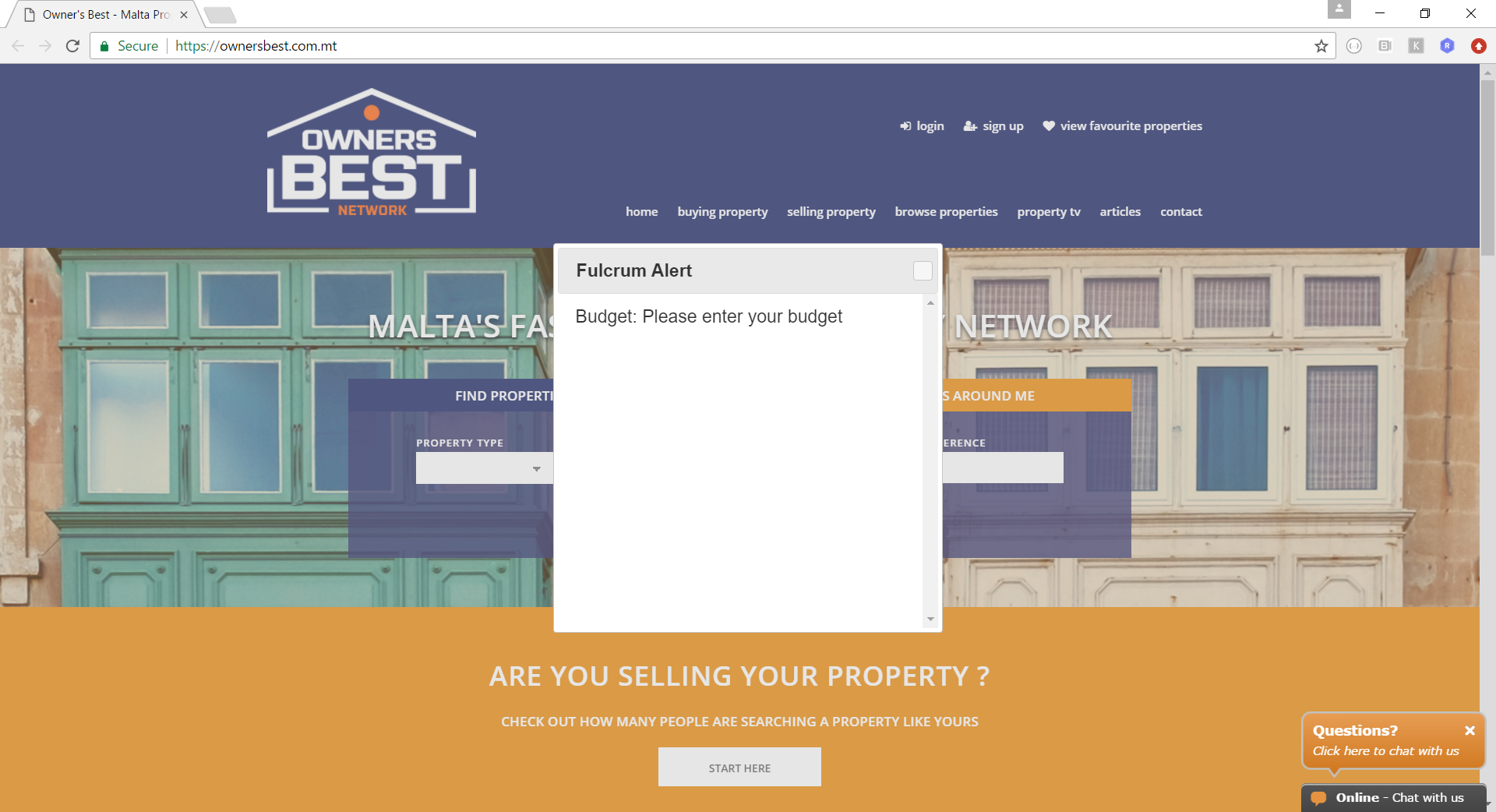
But what the hell is this Fulcrum Alert? And what is wrong with the close buttom? That was a rhetorical question actually. Image 404s in console:

Oh dear. Okay. Let’s put in a budget then.

I put in 10,000. Hey, I’m broke. Obviously, nothing matched, and I got a sad message saying “None properties found”. Yes, you has very good England.

Now I put in a budget of 10 million. That means that I’m super rich, and I’m ready to spend anything up to 10 million on a single property. I got 3 results. Wow. These guys must deal in some real luxury stuff. In fact, two of the results are over budget.

The above search results are based on a 5-million-Euro budget. It gave me this one 4.3-million-Euro bungalow in Dingli. Why didn’t I get this when I searched with 10 million Euros as a budget? 4.3 million is less than 10 million, right?

Now I searched with a budget of 100,000 Euros. Not only do we get all these nice results that would have fitted quite nicely within the several-million-Euro budgets we pretended to have earlier, but we also get properties that are beyond budget, like the one at the top right and the one at the bottom right.

In summary, let’s just say that the search functionality at the Owner’s Best website works in mysterious ways, whether that is intentional or not.

Seasus – Insecure Login

Let’s welcome Seasus among the ranks of the websites that offer an insecure login form:

It is touching to see how much they care about their clients.

Something Different – Various Issues

Let’s take a look at Something Different, a website by Untangled Media (we’ve covered some more of their work in the past).

First, they accept credit card details over an insecure connection. That’s bad. Very bad.

Of course, the credit card iframe itself uses HTTPS, but it’s an HTTPS iframe embeded in an HTTP page, which is still insecure (and illegal – see “The Sorry State of the Web in 2016“), and there is no padlock icon necessary to provide the user with the trust guarantees s/he needs in order to give out his/her sensitive information on the web.

Login is also served insecurely, as you can see above.

We can see another instance of this, as well a lack of a lot of basic validation, in the user registration process:

As you can see above, you can fill in bogus data for most fields. There isn’t even a simple check on the structure of the email address.

In the second step of user registration, you choose a password. Insecurely, of course.

And that’s it! Congratulations for registering your invalid account insecurely!

In this section, we took a look at Something Different. Or rather, more of the same.

Untangled Media / Winit

In Untangled Media‘s Web Publishing section, you’ll find references to various sites including Something Different (see previous section) and something called winit.com.mt:

As they say in the summary, “Everybody loves winning things.” So do I! Let’s follow the link and check out the site.

Oops. Let’s try going to the root of the domain instead.

Win it indeed! It’s more like Untangled Media have lost it.

Summary

April has been a very busy month for spotting issues on websites. We’ve seen a lot of serious security flaws (e.g. insecure login and credit card processing) that have been covered extensively throughout this series.

However, we’ve also spotted a number of issues including high loading times (on one occasion due to the use of large images without thumbnails) and various usability problems. Always keep in mind that websites need to deliver information (whether to sell or otherwise), and thus, information needs to be delivered in a timely, clear, and intuitive manner.

Let’s hope that this article makes some people chuckle, and makes others do a better job of building websites!

Thanks for reading, and stay tuned for the May edition of The Sorry State of the Web! If you find any issue that you would like to include in this series, we would love to hear about it.

The Shameful Web of April 2017 (Part 1)

This article is part of the Sorry State of the Web series, which aims to raise awareness about common and fundamental issues in supposedly professional websites in order to push web developers and designers to raise the bar and deliver at least decent user experience. Since a lot of issues were noted in April 2017, the April issue will be split into two parts. I would like to thank those readers of Gigi Labs who contributed several of the entries in this article.

JobsPlus Receives e-Business Award

In the March 2017 issue of the Sorry State of the Web series, I had pointed out some really basic flaws in the JobsPlus website. That didn’t keep it from receiving an award for “best technology in the e-Government sector”.

Image credit: taken from here

Facebook’s Intrusive Login Prompt

If you view a video on Facebook and you aren’t logged in, you get this login prompt that practically takes up the entire window:

There’s a tiny “Not Now” link at the bottom that you can click. This doesn’t actually remove the prompt, but makes it smaller and moves it to the bottom:

Unfortunately, there seems to be no way to close it, and it still takes up a significant portion of the screen, especially if you are on a laptop. Not very nice!

Don’t Send Passwords via Email

I got this email from a web hosting company:

They never learn. You should never send passwords via email. There is absolutely no guarantee that emails are transmitted via secure channels, so you should assume that it is insecure by default. Instead, let the user choose a password on your website, when the content is served over HTTPS.

Links Should Actually Work

We all know how annoying broken links are, but RightBrain have found a way to match that frustration using links that actually work:

The social media icons at the bottom-right actually point to the website’s homepage, rather than to the social media portrayed by the icons.

It’s not enough that links aren’t broken. Make sure they actually go to the right place!

Microsoft .NET Core Documentation

If you want to learn a little C#‎ (whatever that is supposed to mean), you’re in luck. Microsoft has some tutorials about it:

Seriously though, the .NET Core documentation had some funny HTML entities running around in its sidebar, as you can see above. Very careless, but it looks like they’ve noticed, because this has now been fixed.

Another area where .NET Core documentation is still lacking is in printer-friendliness:

I have written in the past how making webpages printer-friendly is really easy yet very often overlooked. In fact, in the example above, you get around 10 pages of printed content, and the rest of 67 pages which are blank. I have raised this with Microsoft. It seems to be fixed in some browsers (e.g. Edge), and mitigated in Chrome. It’s no longer 67 pages, but at the time of writing this article, you still get quite a few blanks.

Finally, I noticed an issue with their HTTPS. As you can see, you don’t get the padlock indicating that the connection is properly encrypted:

Apparently it’s due to mixed content:

This only happened to me using Firefox on Linux though.

Dear Steve

High up on the list of biggest fails ever in this series is the MySmile dental clinic. There is this contact page with instructions from the dental clinic to a certain “Steve” (presumably from Just Some Coding Ltd, who developed the website) on improvements to make:

Although some pages and links seem to have been renamed, the old “Contact” page shown above is still online!

In any case, Steve didn’t really give a shit, because the map point that he was asked to change still points to the exact same place.

Language Confusion

Unlike JobsPlus, DR Gaming Technology‘s website is really multilingual. In fact, it supports so many languages that one of the language flags actually ended up sitting over the search box:

Despite the language selection, The Latest News box to the right includes many languages at the same time, including English, German and Spanish:

Timely CORS Issue

A friend noted that one of the fonts (Times New Roman) used on the login form of Timely (a web app that I love to hate) looked very out of place.

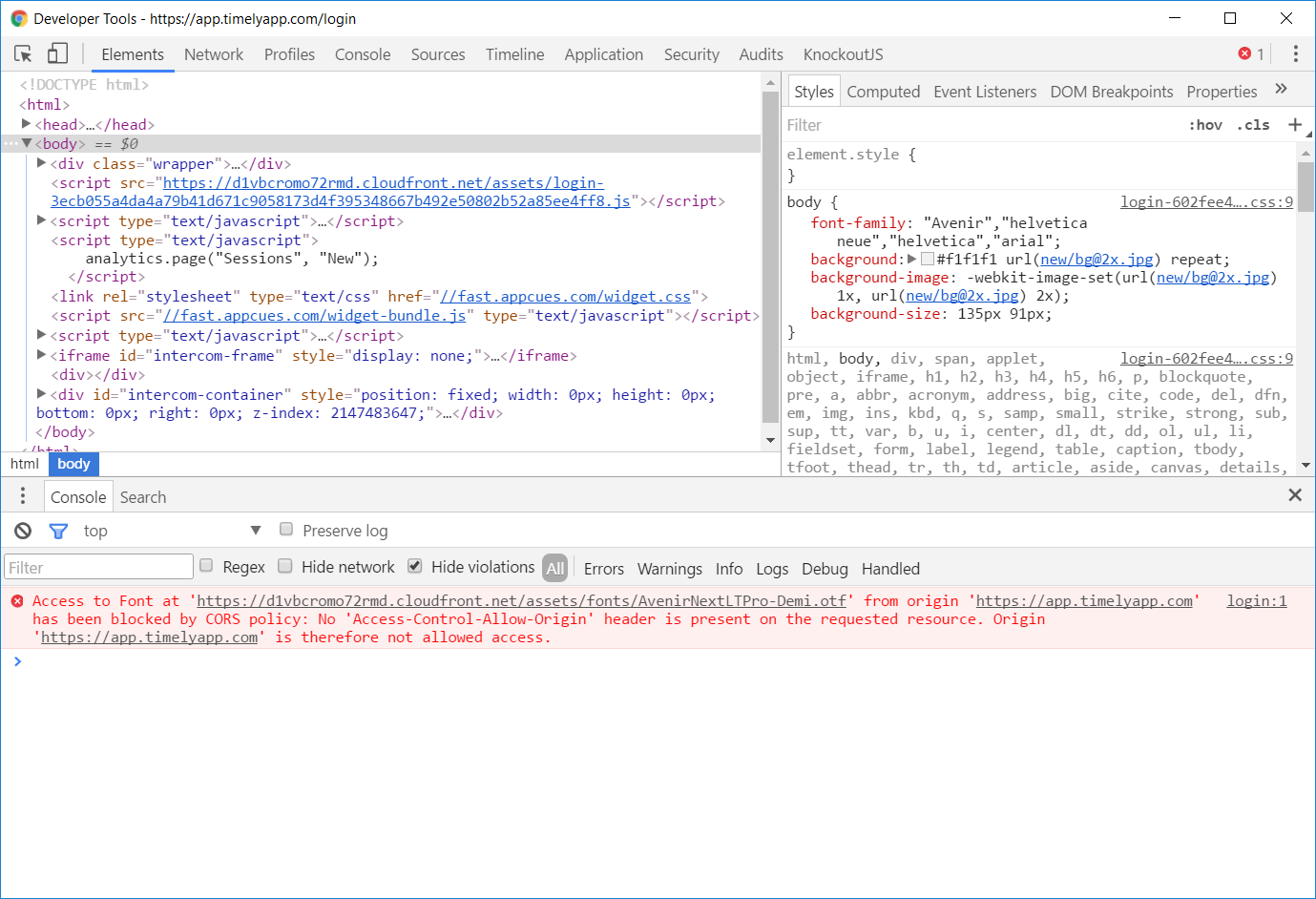
In fact, the developers never intended to use Times New Roman. They wanted a font called Avenir, but the browser defaulted to Times New Roman due to a CORS issue:

Timely fixed this issue within hours, but it wasn’t timely enough to keep me from taking screenshots.

Use Thumbnails

On some articles at Forbes, the images take ages to load. For instance:

What is more depressing than the job ads mentioned in the article? The fact that the image embedded in that page is actually a really large image:

It should be common knowledge now, in 2017, that you should embed a small version of the image (a thumbnail), and link to a larger version. This way, the image won’t impact page loading time, but the people who want to see the detail can opt to do so. This is especially important in galleries with lots of images.

To Be Continued…

More to follow in Part 2.