Many of Malta’s government services can nowadays be accessed online. However, we still lag behind other countries in terms of their usefulness and ease of use. In this article, we’ll see a small example from the website of the Malta Public Registry that throws usability out of the window. As with other articles in The Sorry State of the Web series, and inspired by Vincent Flanders’ Web Pages That Suck, the aim is to learn good web design by looking at bad web design.
A screenshot of Certifikati.gov.mt, the website of the Malta Public Registry.
Certifikati.gov.mt is the website of the Malta Public Registry. I came across it a few days ago, and it has a simple and modern design, similar to many other contemporary websites. However, it makes one fundamental mistake that I haven’t seen in years, and you can see it in the navigation icons in the top-right corner of the website:
The icons in Certifikati’s navigation. Can you guess what they mean?
We have a row of icons, but what do they mean? We can perhaps try to guess, as some are more conventional than others (e.g. the shopping basket). But, to get a real idea of the range of information and services that a website offers, the only way is to hover over the icons one by one:
Hovering over an icon containing a sign post reveals that it means “Certificate Information”.
Aside from the questionable suitability of some of the icons, this kind of design is a tedious exercise in frustration, because instead of a website telling you clearly what it can do for you and where to find the information you want, you have to go and dig it up yourself, one icon at a time.
This is the first instance of Mystery Meat Navigation I’ve seen in many years. Although it used to be very common in the era of Geocities and Flash websites, the change in trend towards more minimal designs and ready-made templates over the course of 25 years thankfully seems to have caused it to fizzle out. As a result, I was very surprised to come across this clear example of regression.
It seems like most people have forgotten about the trap of Mystery Meat Navigation, and by writing about it again, I hope to raise awareness and help people avoid repeating the mistakes of the past.
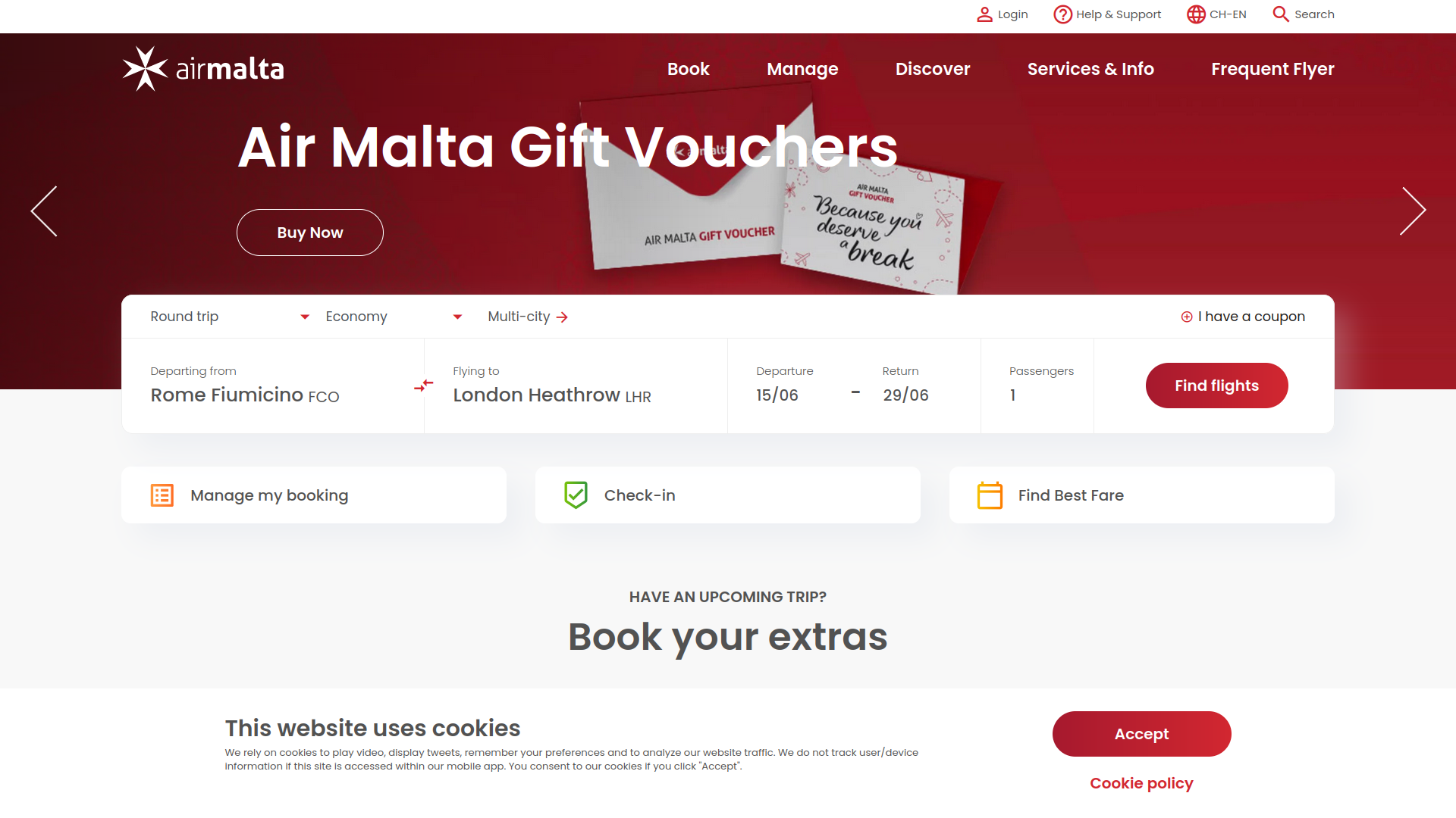
Dealing with Air Malta is always quite frustrating, no matter what you need to do. After the ordeal of booking a flight, detailed in The Sorry State of Air Malta’s Website, it was finally time to catch that dreaded flight. This time, to mitigate potential issues with overbookings, I decided to check-in online.
So, I did what any reasonable person would do: I googled Air Malta’s online check-in, hoping to go straight there:
The first search result brought me to this form:
A friend of mine told me that the process is easy, and the form looked simple enough (as you can see above). What could possibly go wrong?
“Check-in System Error”, it said, “A system error has occurred. Please try again later.” Typical: they don’t tell you what the problem is, and you can try again as many times as you like, because it’s not going to work. Knowing Air Malta’s hatred of apostrophes, I tried my surname with and without the apostrophe, to no avail. I even tried to “Show Additional Options”:
Not only does “Show Additional Options” clear whatever you entered in the first two fields (so you’d have to type them in again if you wanted to go back to using the booking reference), but the 13-digit Ticket Number is nowhere to be found in the flight booking confirmation email.
Later, I figured out what the problem was. If you go to the Air Malta website and proceed to do the online check-in from there, you get to a completely different form which does actually work (except that when you get to the summary, it displays the wrong number of luggages):
What this probably means is that during some rebranding exercise, they set up a new online check-in form, but left the old and dysfunctional one in place, and Google still ranks that as number one.
It’s rather silly to assume that people will reach your website through its homepage. As it turns out, though, Air Malta are not alone. Just today, I wanted to find some recent news on the website of stockbrokers Rizzo, Farrugia & Co. (who, unlike Air Malta, I highly respect), so I did the same thing and googled it:
Clicking on the top result, I ended up here:
Even if you haven’t been to their website before, it’s pretty clear to see that the formatting is a bit of a mess (and doesn’t fit the style of the rest of the site), the dates are in the future, and the download links take you back to the same page. The reason for this is likely the same as with Air Malta’s online check-in: they had some old page that they abandoned in favour of new pages, and forgot to remove it. Or maybe it wasn’t an old page, but one that came back from the future!
To conclude: in the last article about Air Malta’s website, I highlighted the importance of empathy and understanding the journey that the user takes. Here, we’ve seen how the journey doesn’t always start at the homepage, so it’s important to (a) make sure that pages are accessible and functional even when accessed from search engines, and (b) take down any obsolete pages so that they don’t confuse users.
Air Malta is a real mess, but let’s face it: if you live in Malta, for some destinations, you don’t really have any choice but to fly with them. In this article, I’m not going to talk about Air Malta’s long-standing financial woes, their shady practice of overbookings, or their customer service (or lack thereof), none of which have improved over the years.
Instead, in the spirit of the Sorry State of the Web series, I’m going to talk about the simple journey of booking a flight, in the hope that we can learn a thing or two about user experience in the process.
Selecting a flight on AIr Malta’s homepage.
We start off by selecting a flight on Air Malta’s website, which has been redesigned in recent years and looks nice and modern. After selecting the departure and arrival airports and dates, we click on “Find flights”. So far so good.
Can’t Go Back
Oops! There’s no flight on one of the selected dates.
The dates I happened to choose at random included one with no flights available. Instead of picking one from the grid shown in the screenshot above, I preferred to go back and start over. Except that I couldn’t, because there’s some redirect in place that breaks the Back button and brings me back here every time.
Service Charge for No Refund
Okay, so I went back to the homepage and started over, selecting different airports and dates, and making it a one-way flight. This time, I have a choice of flights on the same day, and I can pick between three different fares:
Go Light is Non-Refundable (less €19 service fee).
It seems that Air Malta adapted to the uncertainty of COVID19 by providing varying levels of refundability to their flights depending on the option chosen. In each case, you pay a €19 service fee, including when the flight is non-refundable. Wait what?
Illegal Surnames
Your name is not allowed to have an apostrophe, and you can bring a weightless luggage. The name shown is fictional.
I have a long history of airlines and other websites either not accepting my surname or replacing apostrophes with the HTML entity '. Well, we’re in 2023 and Air Malta still thinks we’re not allowed to have apostrophes in our surnames, even though governments have been perfectly happy to accept them for centuries.
As I wrote in earlier editions of the Sorry State of the Web series, this bullshit is just a case of excessively restricted validation. Any concern about the use of apostrophes for SQL injection is easily dismissed by the fact that nowadays we have (and use… yeah, right) prepared statements.
In fact, I found that characters with diacritics (such as French accents or German umlauts) are also excluded from Air Malta’s definition of “alphabetic characters”:
Your surname can’t have accents either.
Fortunately, I’m not the only one experiencing the frustration of an unacceptable surname on a regular basis. It turns out there’s a “Your Name Is Invalid!” Twitter account which regularly posts similar episodes.
Weightless Luggage
If you look on the right-hand-side of the two screenshots above, you’ll notice that there’s a “1 x 0kg (included)” luggage listed. Perhaps it’s a new offer from Air Malta: bring your hand luggage on board for free, as long as it’s weightless!
Successful Payment
I’m supposed to be redirected… but I’m not!
After paying for the flight, I’m taken to this page with a browser title saying “APCO_AUTH_SUCCESS”. It’s got what seems to be XML in the URL’s querystring, presumably the type of SOAP message that people used to coordinate war efforts during the Crusades.
The page also says “Your payment was successful, you are now redirected to the Confirmation page”. No I’m not! The page doesn’t budge and I’m just stuck here.
Conclusion
It takes more than a fancy website to create a good user experience. Despite my aversion to Air Malta, this is also true of many other websites and web applications, especially in Malta where the bar is rather low.
The most important thing when developing a website or web application is to test it. Everything I’ve shown in this article is easily spotted simply by using the website, following a pretty ordinary journey through the booking process. All these things could have been caught by a developer or an Air Malta employee before reaching customers like me.
Another piece of advice around user experience is to have some empathy. Put yourself in the shoes of the customer. Is your obsession with alphabetic characters going to win any points with a customer simply trying to enter their name? Probably not.
Let’s learn something from this and try to improve. That way we can have happier customers and happier businesses.
IT security is always a big deal. We’ve heard of a lot of data breaches, and all sorts of different attacks (e.g. phishing, ransomware, etc) over the years. A security incident can cost a company its reputation and threaten its survival. But how much worse is it when IT security puts the very safety of your home at risk?
Contactless Check-In: Intro
Over the past year or so, I’ve stayed at some apartments and hotels in the DACH region that were “contactless”. They had no reception; they send you a code and you let yourself in. I’m not sure whether this practice was popularised by the COVID19 pandemic or was already well in force earlier, but I do understand the appeal:
It minimises the risk of catching contagious virus for both staff and guests
It reduces expenses for the company by not needing to pay reception staff
However, it also has some serious flaws:
If there’s any problem with the accommodation, it’s a huge hassle to get someone to fix it.
Even worse, if the entry code doesn’t work for whatever reason, you’re basically screwed.
Still worse, having an entry code sitting in your mailbox is a security accident waiting to happen.
Let’s talk a bit more about that third point.
Don’t Send Passwords via Email
If you work in IT or have at least a basic understanding of the internet, it should be common knowledge at this point that sending passwords via email is a bad idea. Email is not a secure channel; each email message can go through a number of devices and servers, unencrypted by default, and can be compromised at any point during that journey.
That’s why every bank seems to invent its own secure messaging mechanism. They have to deal with enough fraud and security incidents already, and email is a relatively easy attack vector. And yet, I’ve written about cases of passwords being sent by email in the past, e.g. “The Shameful Web of April 2017 (Part 1)“, “The Pitiful State of the Web in May 2017 (Part 2)“.
Beyond the danger of being intercepted in transit, a bigger problem with email is that it can stick around for a long time. So if you have an email that contains a password, someone could obtain illegal access to your email on a server or on one of your own devices at some point in the future and, unless you’ve been diligently changing your passwords regularly, would still be able to use that password nefariously.
Nowadays, when you sign up for a new account, the best practice is for the service to send you a limited-time activation link that then lets you choose your own password via their web interface (securely over HTTPS, of course). It’s still risky, but there is a limited time window so an attacker would have to gain access to that email in the short time before the link either is consumed or expires. Using multi-factor authentication further reduces the risk considerably.
Contactless Check-In: Codes
If it’s so risky to send a password via email, how much worse is it to send a code that gives access to your hotel room or apartment?
There are a couple of places I’ve been to that send you a code for either the apartment or a key box that is valid for the first day. When you arrive, you use that code and get a key, which you then have to use for the remainder of your stay. This is similar to sending an activation link via email, so there’s a limited time window for an attacker. But I’d argue that the risk of someone getting into your room or apartment and robbing you is much higher than some prankster setting your Facebook profile picture to that of a horse, so I don’t think this approach is acceptable.
It gets worse. Vision Apartments send you a code that remains active for the duration of your stay (potentially several weeks or months), is the only way to access your ‘apartment’, and gives access to the front door of the building, your ‘apartment’, and your mailbox. That code remains active and is available to Vision’s staff as well as potentially anyone who gains access to your email during the entire duration of your stay.
Did you accidentally forward the email to the authorities? Oops. They technically now have access to your ‘apartment’.
Did you leave your home laptop or mobile phone unprotected while guests were around? Not great either.
Did you accidentally fall for a social engineering scam and reveal your email password?
Did someone brute force your email account’s password?
Did someone intercept the email on one of the servers it went through while it was being sent?
Some of the above cases might sound stupid, but people do fall for scams all the time, and they are subject to identity theft, fraud, and other crimes. That’s bad enough. You wouldn’t want to leave your house keys hanging where anyone can just pick them up.
Would you leave your keys outside the front door like this? (Image source)
If someone manages to get hold of that email and code, they basically have control over your living space, your physical mail, your belongings, and your life. That’s pretty scary.
Note: I’ve already mentioned in “Surviving in Canton Zurich” that I had a terrible experience with Vision Apartments. The security aspect is one of many things that bothered me, and it would take a whole long article just to explain all of them. If you’re considering staying with Vision, do yourself a favour and don’t, or at least read some reviews first.
Conclusion
Whatever the reason behind contactless check-in, it’s a terrible idea. It’s both bad service and bad security. In fact, it’s a security accident waiting to happen. It might also possibly be in breach of data protection laws.
It’s not worth the risk. So before you stay at an accommodation, always make sure they do actually have a reception.
I first visited Ireland around this time eight years ago, for St. Patrick’s Day 2012. It did not take me long to fall in love with the place. Since then, I have revisited Ireland other times, lived there for about a year and a half, and been around most of the country. As a result, my Irish experience has been a mixture of thrills and disappointments.
Separate hot and cold water taps (when hot water is actually available) is a disease more prevalent in Ireland than the Coronavirus.
When I recently revisited Ireland around the same time that the Coronavirus outbreak started, I once again had mixed feelings. Many things were really nice, but I wasn’t spared any disappointments.
As part of the Sorry State of the Web series, in which I promote good web development practices by illustrating bad ones, I will focus on websites (and other technology services) I came across during my research for this trip. Other things that annoyed me, such as cafes charging you an extra 2 Euros just to toast your sandwich, will be out of scope.
Aran Islands
The Aran Islands may be beautiful, but their website could have been better.
In fact, they did make it better by fixing this problem with ampersand HTML entities showing within the page.
Insecure WiFi at Penneys
Penneys, the chain of department stores that you might otherwise recognise as Primark in the UK, offers free WiFi to their customers.
Unfortunately, given that you need to join the WiFi via an endpoint that does not come with a proper SSL certificate, it is not only useless, but plain risky for customers to use.
For starters, some of the links at the bottom (i.e. Terms & Conditions, Privacy, and Cookies) don’t work. The cursor doesn’t even turn into a pointer, and if you look at the HTML, it seems they put anchor tags without href attributes.
On the Animals page, images take ages to load because they used huge images in the page without using thumbnails (see also: The Shameful Web of April 2017 (Part 1)). If you’re including large images in a page, always use small versions and link to the larger version.
There also seems to be a problem with HTTPS… we’ll get to that too.
Going on the online booking system (which is what we care about when it comes to HTTPS, since sensitive information is involved), we see that HTTPS looks okay so far. They also used to have a test ticket type that I’m happy to see has been removed. In fact, they recently updated this page with a plea for funds since Coronavirus is messing up their business (understandably).
Unfortunately, when you proceed to the next step and are about to book a ticket, the connection suddenly isn’t secure any more. It’s a small mixed content problem because of an image, but the problem is that it undermines the trust that people have in such websites (when it comes to keeping their sensitive financial data secure), and can potentially have security-related consequences.
So while I sympathise with Secret Valley (and so many others affected by the Coronavirus), it’s also important to keep your data safe. By all means, send them money, but do it using alternative, secure means.
The M50 Toll
If you’re going to be renting a car in Dublin and using it to drive around the country, one of the things you’re going to have to do is pay the toll on the M50 motorway. The M50 uses a barrier-free toll system that can be paid online by 8pm on the next day.
While the close deadline is a little annoying, being able to pay it online is quite convenient… when it works.
In this case, the system just didn’t want to work, although I tried several times. This can happen, but what is a little worrying here is that I don’t think those details about the error (the XML-like thing) should be disclosed to the customer.
Blackrock Castle Observatory
If you like science, then Blackrock Castle Observatory is a great place to visit. They have a lot of interactive exhibits that explain concepts from astronomy and science in general:
Wait… what’s that at the bottom-right, where the arrow is pointing? Let’s take a closer look:
Uh oh… someone didn’t activate Windows! That’s quite embarrassing, and can be seen on several of their exhibits.
Wrap Up
Although Ireland will always have a special place in my heart, it hasn’t spared me any disappointments, both in terms of the service I received in various places as a tourist, but also on websites and other technology-related services.
This article, like others in the same series, is an educational exercise aimed at improving technology standards, especially on the web which so many people come in contact with. The aim is to learn from this and provide a better service, so I hope that nobody is offended, particularly in this difficult time.
Instead, I hope that in such times, when we depend on technology so much more, we can overcome these obvious problems and use technology safely and reliably to reduce the burden of living in a difficult situation as much as possible.
With the Coronavirus currently devastating health, economy, tourism and peace of mind across the world, we need to be safe, help each other, and show empathy because so many people are affected in different ways.
"You don't learn to walk by following rules. You learn by doing, and by falling over." — Richard Branson