Tag Archives: Usability

The Return of Mystery Meat Navigation

Many of Malta’s government services can nowadays be accessed online. However, we still lag behind other countries in terms of their usefulness and ease of use. In this article, we’ll see a small example from the website of the Malta Public Registry that throws usability out of the window. As with other articles in The Sorry State of the Web series, and inspired by Vincent Flanders’ Web Pages That Suck, the aim is to learn good web design by looking at bad web design.

A screenshot of Certifikati.gov.mt, the website of the Malta Public Registry.

Certifikati.gov.mt is the website of the Malta Public Registry. I came across it a few days ago, and it has a simple and modern design, similar to many other contemporary websites. However, it makes one fundamental mistake that I haven’t seen in years, and you can see it in the navigation icons in the top-right corner of the website:

The icons in Certifikati’s navigation. Can you guess what they mean?

We have a row of icons, but what do they mean? We can perhaps try to guess, as some are more conventional than others (e.g. the shopping basket). But, to get a real idea of the range of information and services that a website offers, the only way is to hover over the icons one by one:

Hovering over an icon containing a sign post reveals that it means “Certificate Information”.

Aside from the questionable suitability of some of the icons, this kind of design is a tedious exercise in frustration, because instead of a website telling you clearly what it can do for you and where to find the information you want, you have to go and dig it up yourself, one icon at a time.

In fact, there is a name for this. It’s called Mystery Meat Navigation, a term coined by Vincent Flanders (of Web Pages That Suck) back in 1998. You can read about it in Flanders’ Introduction to Mystery Meat Navigation, Wikipedia’s Mystery Meat Navigation page, or my “On Mystery Meat Navigation and Unusability” article (originally published in 2013 at Programmer’s Ranch, and republished two years later here at Gigi Labs).

This is the first instance of Mystery Meat Navigation I’ve seen in many years. Although it used to be very common in the era of Geocities and Flash websites, the change in trend towards more minimal designs and ready-made templates over the course of 25 years thankfully seems to have caused it to fizzle out. As a result, I was very surprised to come across this clear example of regression.

It seems like most people have forgotten about the trap of Mystery Meat Navigation, and by writing about it again, I hope to raise awareness and help people avoid repeating the mistakes of the past.

The Sorry State of Air Malta’s Online Check-In

Dealing with Air Malta is always quite frustrating, no matter what you need to do. After the ordeal of booking a flight, detailed in The Sorry State of Air Malta’s Website, it was finally time to catch that dreaded flight. This time, to mitigate potential issues with overbookings, I decided to check-in online.

So, I did what any reasonable person would do: I googled Air Malta’s online check-in, hoping to go straight there:

The first search result brought me to this form:

A friend of mine told me that the process is easy, and the form looked simple enough (as you can see above). What could possibly go wrong?

“Check-in System Error”, it said, “A system error has occurred. Please try again later.” Typical: they don’t tell you what the problem is, and you can try again as many times as you like, because it’s not going to work. Knowing Air Malta’s hatred of apostrophes, I tried my surname with and without the apostrophe, to no avail. I even tried to “Show Additional Options”:

Not only does “Show Additional Options” clear whatever you entered in the first two fields (so you’d have to type them in again if you wanted to go back to using the booking reference), but the 13-digit Ticket Number is nowhere to be found in the flight booking confirmation email.

Later, I figured out what the problem was. If you go to the Air Malta website and proceed to do the online check-in from there, you get to a completely different form which does actually work (except that when you get to the summary, it displays the wrong number of luggages):

What this probably means is that during some rebranding exercise, they set up a new online check-in form, but left the old and dysfunctional one in place, and Google still ranks that as number one.

It’s rather silly to assume that people will reach your website through its homepage. As it turns out, though, Air Malta are not alone. Just today, I wanted to find some recent news on the website of stockbrokers Rizzo, Farrugia & Co. (who, unlike Air Malta, I highly respect), so I did the same thing and googled it:

Clicking on the top result, I ended up here:

Even if you haven’t been to their website before, it’s pretty clear to see that the formatting is a bit of a mess (and doesn’t fit the style of the rest of the site), the dates are in the future, and the download links take you back to the same page. The reason for this is likely the same as with Air Malta’s online check-in: they had some old page that they abandoned in favour of new pages, and forgot to remove it. Or maybe it wasn’t an old page, but one that came back from the future!

To conclude: in the last article about Air Malta’s website, I highlighted the importance of empathy and understanding the journey that the user takes. Here, we’ve seen how the journey doesn’t always start at the homepage, so it’s important to (a) make sure that pages are accessible and functional even when accessed from search engines, and (b) take down any obsolete pages so that they don’t confuse users.

This article is part of The Sorry State of the Web series.

The State of Drag and Drop in Linux

A few months ago, looking for a replacement for Windows (which always finds new ways to get on my nerves), I spent a couple of weeks playing with Linux Mint with MATE desktop. During this test drive, one of the annoyances I came across was the inability to drag a URL from Chromium’s address bar to create a link on the desktop. I literally ended up asking for help, and still didn’t figure it out.

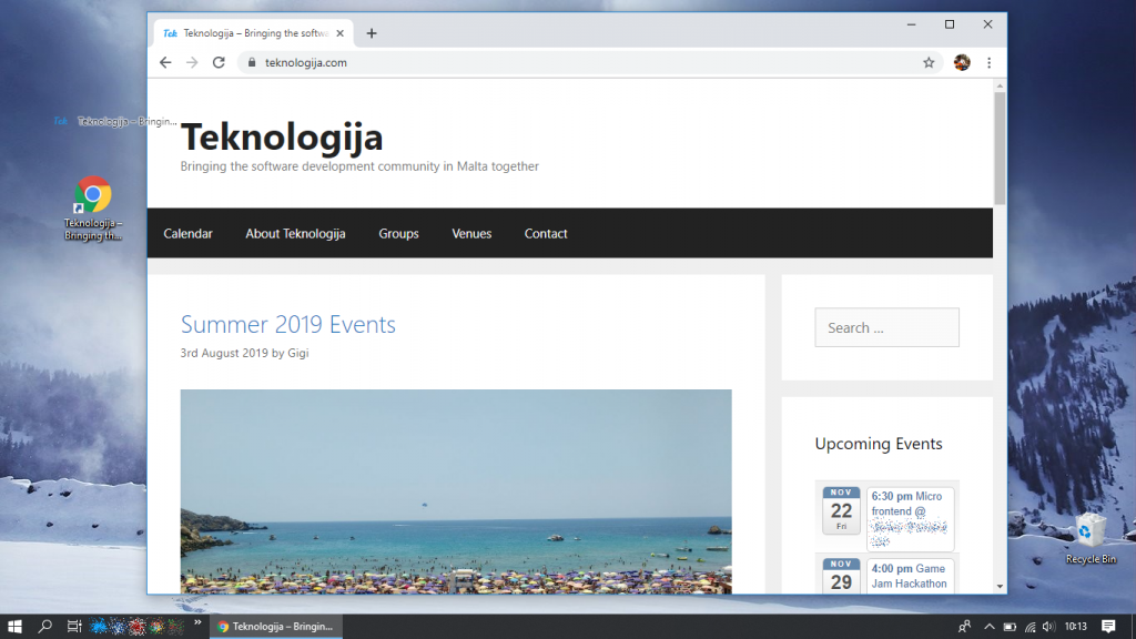
Creating a URL shortcut on a Windows 10 desktop by dragging the padlock icon in Chrome

In Windows, this is something I’ve been doing for many, many years. It’s not rocket science. You drag the padlock icon next to the address bar onto your desktop and a shortcut is created, pointing to that URL.

Ubuntu 19.10

Since Ubuntu 19.10 was released a week and a half ago, I thought I’d try it out. The first thing I figured I’d make sure was that I could drag and drop links to the desktop. Ubuntu is one of the most popular and mature operating systems around. Surely they’d support such a basic usability feature, right?

Ubuntu 19.10 doesn’t let you drag links to the desktop.

Well, it turns out that dragging links from default browser Firefox to the desktop has no effect whatsoever. Odd, isn’t it? Let’s try dragging that link to some other folder instead.

We try dragging a link from Firefox to the Documents folder
“Drag and drop is not supported. An invalid drag type was used.”

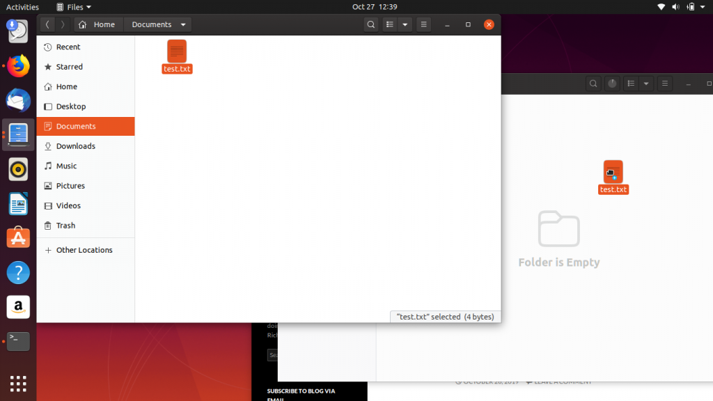
That’s annoying. I mean, drag and drop is a really basic feature that has been around forever. Let’s try dragging a file from one folder to another… obviously that’s going to work, no?

It looks like it’s going to work, but it doesn’t.

As you drag the file, a little plus icon appears beneath the hand as if to tell you that something’s going to happen. Alas, however, this also has no effect.

And of course, dragging the file to the desktop similarly does not work:

Dragging the file to the desktop has no effect

So we can’t drag links from Firefox, and we can’t drag and drop files. Maybe we’ll have better luck with Chromium?

We try dragging a link from Chromium into the Documents folder
Once again, we get that “Drag and drop is not supported” failure.

So it seems, like someone hinted in that original question about drag and drop in Linux Mint, that this has nothing to do with the browser and is something related to the desktop environment.

Once again, I had to swallow that feeling of incompetence and ask for help with this. Aside from the usual Stack Overflow treatment of getting my question closed as a duplicate, one of the comments led to other Q&As that uncovered a bitter truth: that drag and drop support was intentionally removed. Why would anyone in their right state of mind do that?

Kubuntu 19.10

Incredulous, I decided to try the KDE flavour of Ubuntu — Kubuntu. Drag and drop a link from browser to desktop? No problem:

We drag the padlock icon next to the address bar to the desktop
A context menu appears, asking what we want to do with the URL. “Link Here” creates the equivalent of a desktop shortcut in Windows.
An icon is created on the desktop, leading to the webpage we wanted to keep track of.

Was that really so hard? I get it, there were reasons why GNOME decided to do away with desktop icons and the like. But surely there are better ways to solve the problem than to do away with a basic and essential usability feature.

A desktop environment without basic drag and drop support in… almost 2020… is just garbage.