Tag Archives: Windows 10

Inconsistent Toggles in Windows 10 Taskbar Menu

There’s something I found really odd about the Windows 10 taskbar. There are two special buttons next to the Start button: the Search button, and the Task View button. You can toggle the visibility of each from the context menu that comes up when you right click on the taskbar.

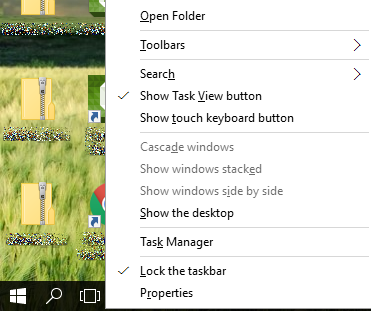
We can toggle the Task View button by simply clicking on the “Show Task View button” item in the menu. When the Task View button is visible, this item is checked:

win10-show-task-view-on

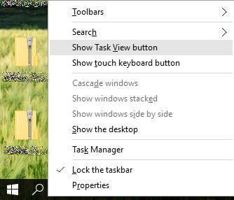
…and when it’s not visible, the item is not checked:

win10-show-task-view-off

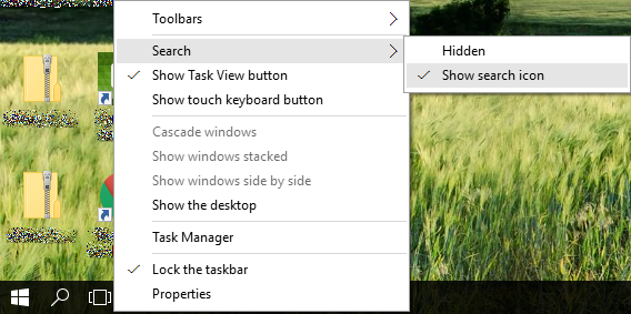
Simple, no? Let’s do the same for the Search button. Right now it’s on…

win10-show-search-on

So when I click “Show search icon”, following the same logic as with the Task View button, I would expect it to disappear, right?

Nope. Clicking that won’t do anything, because you instead have to select “Hidden”. Then, when Search is not visible, it looks like this instead:

win10-show-search-off

Okay, it’s easy to get used to this after tripping on it the first time. But why would anyone ever provide these kinds of confusing and inconsistent options?

Aside from this, that Search submenu is clearly overkill, given that they could have implemented a single toggle menu item as with Task View. This is exactly like using two checkboxes for the opposites of same thing and expecting them to be mutually exclusive. By way of analogy, can you imagine how stupid this would look?

win10-gender-analogy

This would tell you that the Male and Female options are unrelated; you could potentially pick both.

Update 24th December 2015: As pointed out in these comments on Reddit, apparently the reason for having a separate menu for the Search icon is that in regions where Cortana is enabled, there are actually three options. They could have at least used bullets instead of checkmarks though, which would have made them feel like radio buttons (making the mutual exclusion obvious) rather than checkboxes.

Reserving Windows 10 Upgrade

Windows 10 will be released on 29th July, and it’s no secret that it will be a free upgrade from Windows 7 or 8. In fact, a special icon is currently appearing in the system tray, allowing us to reserve our upgrade – possibly to spread out the download rather than have everyone hit the servers on launch day.

When you click on the system tray icon, a small application gives you an overview of what’s coming in Windows 10, and allows you to reserve the upgrade. Below are screenshots of this application (from 3 weeks ago), included here as a historical record. The application is slightly different today, but more or less conveys the same message.

The Windows 10 window style you never see

I am currently installing the Visual Studio 2015 Preview on the machine where I have the Windows 10 Preview installed, and since it’s an old machine with just 1GB RAM, Windows started hanging at times. The screenshot below shows what the installer looked like while it was hanging:

win10-legacy-header

See that tiny box towards the top of the screenshot? I guess that’s what windows actually look like before the clunky window style we’re familiar with gets rendered over it.

It’s nothing new – I’ve written before about legacy window styles appearing in Windows XP and this seems to continue that trend. The window style above has a very Windows 2000 feel to it, and I personally prefer it over what we have today in Windows 8+.

Windows 10: Switching between Start Menu and Start Screen

Windows 10 Technical Preview brings back the Start Menu (as I wrote in my recent 20-minute review), which replaces the tiled Start Screen that was prevalent in Windows 8 and 8.1.

However, for those who actually liked the Start Screen, you can bring it back by changing a simple setting. First, bring up the Taskbar and Start Menu Properties, either by right-clicking on the taskbar and selecting Properties, or by typing “Navigation” in the Start Menu’s search bar and selecting either of the options provided:

win10-navigation-search

Switch to the Start Menu tab, and then turn off the “Use the Start menu instead of the Start screen” option:

win10-start-screen-setting

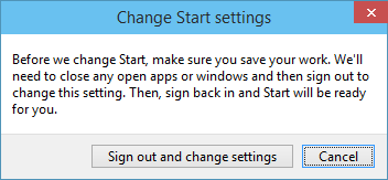
You will then be prompted to sign out and sign back in again to effect the change:

win10-start-screen-sign-out

Once you do this, you still go directly into the desktop. But when you click on the Start button or press the Windows key on your keyboard, you are taken to the Start Screen instead of the Start Menu:

win10-start-screen

A 20-minute review of Windows 10 Technical Preview

A few weeks ago, Microsoft released the Windows 10 Technical Preview. Here is a very quick overview of what’s new.

Return of the Start Menu

win10-start-menu

Many of us sorely missed the start menu in Windows 8, and dreaded having to search for programs in a tiled mess. Windows 10 brings back the start menu, combining the traditional search menu functionality we used up to Windows 7 (including searching for programs) and the live tiles from Windows 8.

Windowed Store Apps

Windows Store apps introduced with Windows 8 (formerly known as “Metro” apps, but that name has since been dropped due to legal reasons) have typically taken up the entire screen, which was pretty dumb in cases such as the  music player which really only needs to show a few buttons for its UI.

win10-windowed-apps

That changes in Windows 10, where even the Windows Store apps can be hosted in their own window. This comes with its own limitations though – the minimum width and height of a windowed Windows Store app seem to be what you see in the screenshot above.

Improved Docking

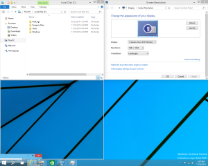
In previous editions of Windows, you could drag a Window to the top edge of the screen to maximize it, or to a lateral edge to dock it to that half of the screen.
win10-docking-1

In Windows 10, you can now dock a window to a quarter of the screen by dragging it into a corner. You can also dock a window to the bottom half of the screen by dragging it towards the taskbar.

win10-docking-2

As you are performing this action, you will even get suggestions on how to fill the remaining space with windows that are already open.

The usefulness of this feature is limited by the fact that windows docked to a quarter of the screen are inevitably quite small, and it does not yet work perfectly – for instance, there is no way to dock the task manager as yet.

Virtual Desktops

I first experienced virtual desktops in Linux almost 10 years ago, and Microsoft are finally adding them to Windows. Better late than never, but still very much appreciated.

win10-virtual-desktops

Virtual desktops are a great way to organize your windows according to different projects you may be working on. I never liked the grouping of taskbar icons by application: if you’re working on three different projects simultaneously, each one might have a Word document open, so it doesn’t really help to group all the Word documents. It’s much more convenient to switch desktop when moving from one project to another.

Improved Selection/Clipboarding in Command Prompt

The command prompt has finally become more usable. You can actually select portions of text normally rather than having to resort to block selection:

win10-command-prompt

…and it is now much easier to copy and paste text in the command prompt. To copy, just select the portion of text you want and press Ctrl+C – the command prompt is intelligent enough to treat Ctrl+C as a clipboard copy if text is selected, or as a process termination signal if no text is selected. Ctrl+V works just fine for pasting text.

Setup Experience

Since the start menu has pretty much replaced the tiled start screen on desktops, it is quite possible to live without the “Metro” experience. However, although the Windows installation routine may have changed a little since Windows 8, the experience hasn’t: it still features an all-Metro interface, attempts to get you to sign into Windows with a Microsoft account by default, and at one point displays some dumb text with nauseating rotating background colours rather than reporting on progress.

win10-setup

Visual Improvements

I noticed that windows now have a soft shadow, which makes the ugly window layout from Windows 8 more bearable:

win10-shadows

Summary

This was just a very quick overview of what has changed in Windows 10, after spending only a few minutes trying it out. I’m sure there are many other features I’ve missed, and this is pre-release software, so take this article for what it is.

My impression is that Windows 10 is nowhere near as horrible as Windows 8, but still does not live up to Windows 7 in terms of user experience.

Pros:

  • Start menu instead of start screen
  • Virtual desktops
  • Docking
  • Windowed Windows Store apps
  • Improved command prompt
  • Visual improvements

Cons:

  • “Metro” still dominates Windows installation
  • Start menu still has live tiles