Tag Archives: SorryStateOfTheWeb

The Shameful Web of April 2017 (Part 1)

This article is part of the Sorry State of the Web series, which aims to raise awareness about common and fundamental issues in supposedly professional websites in order to push web developers and designers to raise the bar and deliver at least decent user experience. Since a lot of issues were noted in April 2017, the April issue will be split into two parts. I would like to thank those readers of Gigi Labs who contributed several of the entries in this article.

JobsPlus Receives e-Business Award

In the March 2017 issue of the Sorry State of the Web series, I had pointed out some really basic flaws in the JobsPlus website. That didn’t keep it from receiving an award for “best technology in the e-Government sector”.

Image credit: taken from here

Facebook’s Intrusive Login Prompt

If you view a video on Facebook and you aren’t logged in, you get this login prompt that practically takes up the entire window:

There’s a tiny “Not Now” link at the bottom that you can click. This doesn’t actually remove the prompt, but makes it smaller and moves it to the bottom:

Unfortunately, there seems to be no way to close it, and it still takes up a significant portion of the screen, especially if you are on a laptop. Not very nice!

Don’t Send Passwords via Email

I got this email from a web hosting company:

They never learn. You should never send passwords via email. There is absolutely no guarantee that emails are transmitted via secure channels, so you should assume that it is insecure by default. Instead, let the user choose a password on your website, when the content is served over HTTPS.

Links Should Actually Work

We all know how annoying broken links are, but RightBrain have found a way to match that frustration using links that actually work:

The social media icons at the bottom-right actually point to the website’s homepage, rather than to the social media portrayed by the icons.

It’s not enough that links aren’t broken. Make sure they actually go to the right place!

Microsoft .NET Core Documentation

If you want to learn a little C#‎ (whatever that is supposed to mean), you’re in luck. Microsoft has some tutorials about it:

Seriously though, the .NET Core documentation had some funny HTML entities running around in its sidebar, as you can see above. Very careless, but it looks like they’ve noticed, because this has now been fixed.

Another area where .NET Core documentation is still lacking is in printer-friendliness:

I have written in the past how making webpages printer-friendly is really easy yet very often overlooked. In fact, in the example above, you get around 10 pages of printed content, and the rest of 67 pages which are blank. I have raised this with Microsoft. It seems to be fixed in some browsers (e.g. Edge), and mitigated in Chrome. It’s no longer 67 pages, but at the time of writing this article, you still get quite a few blanks.

Finally, I noticed an issue with their HTTPS. As you can see, you don’t get the padlock indicating that the connection is properly encrypted:

Apparently it’s due to mixed content:

This only happened to me using Firefox on Linux though.

Dear Steve

High up on the list of biggest fails ever in this series is the MySmile dental clinic. There is this contact page with instructions from the dental clinic to a certain “Steve” (presumably from Just Some Coding Ltd, who developed the website) on improvements to make:

Although some pages and links seem to have been renamed, the old “Contact” page shown above is still online!

In any case, Steve didn’t really give a shit, because the map point that he was asked to change still points to the exact same place.

Language Confusion

Unlike JobsPlus, DR Gaming Technology‘s website is really multilingual. In fact, it supports so many languages that one of the language flags actually ended up sitting over the search box:

Despite the language selection, The Latest News box to the right includes many languages at the same time, including English, German and Spanish:

Timely CORS Issue

A friend noted that one of the fonts (Times New Roman) used on the login form of Timely (a web app that I love to hate) looked very out of place.

In fact, the developers never intended to use Times New Roman. They wanted a font called Avenir, but the browser defaulted to Times New Roman due to a CORS issue:

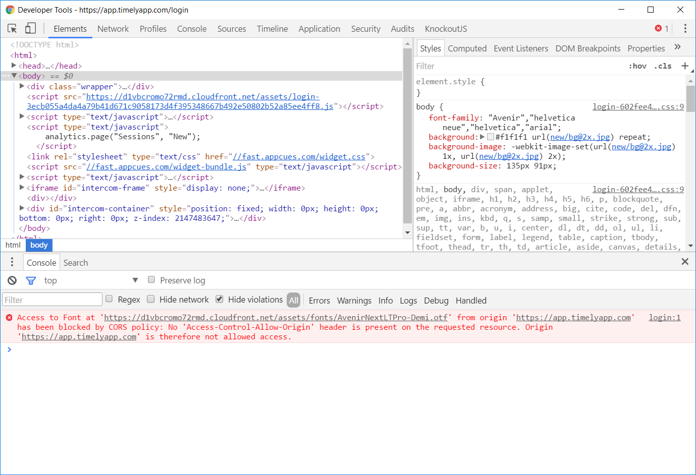
Timely fixed this issue within hours, but it wasn’t timely enough to keep me from taking screenshots.

Use Thumbnails

On some articles at Forbes, the images take ages to load. For instance:

What is more depressing than the job ads mentioned in the article? The fact that the image embedded in that page is actually a really large image:

It should be common knowledge now, in 2017, that you should embed a small version of the image (a thumbnail), and link to a larger version. This way, the image won’t impact page loading time, but the people who want to see the detail can opt to do so. This is especially important in galleries with lots of images.

To Be Continued…

More to follow in Part 2.

The Broken Web of March 2017

This article is the March 2017 issue of the monthly series that started with “The Sorry State of the Web in 2016“, showing all kinds of blunders on websites ranging from the silly to the insecure and illegal. While I spot a good number of these myself, many are brought to my attention by contributors, and I would like to thank them all.

JobsPlus

JobsPlus, which is the ridiculous new name for what used to be ETC, had launched a new website as part of their rebranding.

Despite that, their content still can’t handle apostrophes, not to mention basic formatting such as bulleted lists:

At least, it was built with internationalisation in mind. In fact, you can choose a language…

…with a single selection of English. That’s very useful indeed!

JobsPlus also have a service where they send a daily email with all new vacancies. Typically there are no new vacancies during weekends, but they still send an empty email. This has been going on for around 10 years if not more (formerly as ETC, of course).

Henley Malta

The Henley MBA might teach you many useful things, but building a basic website is definitely not one of these!

In fact, here are two basic things you should never have on your website:

  1. Broken images
  2. Misleading links that unexpectedly open your email application.

Just Some Coding

The only thing worse than a misleading link is something that looks like a link but is not, as you can see on Just Some Coding Ltd‘s website.

There are many ways to emphasise text on the web, but underlining is not a good one. Underlining is usually associated with a link, so when you see big green underlined text like “art” or “functional”, the typical user might try to click on it, only to realise that it’s not actually a link.

Maypole

Maypole is yet another website insecurely accepting credit card information:

Secured by Thawte indeed, but there’s no padlock. We’ve been through this several times before and I won’t bore you by repeating the details, but refer back to “The Sorry State of the Web in 2016” if you don’t understand why this is bad.

MFSA Registry

Let’s also welcome the MFSA Registry into the the realm of oft-repeated security issues, in this case that of having an untrusted SSL certificate:

As if that wasn’t enough, the same website also accepts login details over an insecure connection:

Bank Cross-Origin Issue

I recently caught some functionality in a local bank’s webite that was completely broken because of this cross-origin problem:

That’s not nice to have in a production environment.

Owner’s Best

Owner’s Best recently launched a new website, and not without issues. Until the time of writing this article, you can still see “Error: Rows Not Set” at the bottom of the page:

At one time, I was checking out a particular property, and they have these buttons on the side where you can see the floor plan and other details:

When clicking one of these buttons, however, I was taken to this contact form:

I was really confused by the fact that this contact form came up instead of the floor plan I was expecting, and the back button wasn’t working either.

What actually happened was this: the contact form is actually right below the property detail shown in the earlier screenshot, so properties that don’t have additional info will cause those buttons to link to an empty anchor, which has the side effect of bringing the contact form to the top of the page. The least they could have done is hide the buttons if the relevant detail is not there for the current property.

Roller Blades Malta

There’s one important lesson we can take away from Roller Blades Malta: don’t enter website content when you’re drunk.

Star Web Malta

Woe be upon thee, if thou hast an invalid WoeID:

Transport Malta

We all love Transport Malta, and for those who want to actually communicate their love, they have a contact form (note also the messed up action / social media list on the side):

Unfortunately, however, they don’t want to receive your love. The contact form goes to this page:

Transport Malta also joins the list of websites that accept login details on an insecure channel:

TVM

TVM‘s website, unlike that of JobsPlus, is in both English and Maltese. However, they forgot to translate “Sign In / Register” in the Maltese version:

WhatsOn

whatson.com.mt is another website accepting login details over an insecure channel:

Before you can login or register, though, you have to get past the cookie-acceptance text that comes up in front of the login/register form. This text tells you that you have to accept cookie usage to proceed, but the site has already set cookies regardless of your acceptance.

Xamarin University

When you sign up for Xamarin University, you have to consent to Microsoft to spam you.

While they say that you can unsubscribe at any time, I don’t want Microsoft sending me trash in the first place.

I also was unable to access some of the site’s functionality, because their JavaScript was broken:

Summary

We’ve seen quite a few bad things in this article, and I have even more lined up for the April issue. As always, feel free to bring to my attention any blunders you have experienced and feel should be included.

I have summarised various points to improve upon in earlier articles, and feel there would be little benefit by repeating them in this one.

However, I just want to remind everyone why I am writing these articles: it’s not to put shame on any particular website, but to learn about the bad things on the web today and avoid repeating them in the future. These experiences are painful to visitors of such websites, and embarrassing for the website developers and the companies commissioning them. Let’s all learn from our mistakes and create a better web for all!

Lost in Cyberspace in February 2017

This article continues the series started with “The Sorry State of the Web in 2016“, showing various careless and irresponsible blunders on live websites.

Virtu Ferries

A friend reported that the website for Virtu Ferries accepts credit card details over a non-HTTPS connection, specifically when you create a new booking. When I went in and checked, I confirmed this, but also found a number of other issues.

We can start off with a validation error that appears in an orange box in Italian, even though we are using the English version of the website:

Then, we can see how this website really does accept credit card details over an HTTP (as opposed to HTTPS) connection:

This is similar to Lifelong Learning (refer to “The Sorry State of the Web in 2016” for details on that case and why it is bad) in that it uses an HTTPS iframe within a website served over plain and unencrypted HTTP. I have since confirmed that this practice is actually illegal in Malta, as it violates the requirements of the Data Protection Act in terms of secure transmission of data.

Given that the website accepts credit card details over an insecure connection, you obviously wouldn’t expect it to do any better with login forms and passwords:

If you take long to complete the booking, your transaction times out, and you are asked to “Press Advance to Retry”:


But when you do actually press the Advance button, you get a nice big ASP .NET error:

This is really bad because not only is the website broken, but any errors are actually visible from outside the server, as you can see above. This exposes details about what the code is doing (from the stack trace), third party libraries in use (Transactium in this case), and .NET Framework and ASP .NET versions. This is a serious security problem because it gives potential attackers a lot of information that they can use to look for flaws in the web application or the underlying infrastructure.

Lost in Cyberspace

At the bottom of the Virtu Ferries website, you’ll find that it was developed by Cyberspace Solutions Ltd. By doing a quick Google search, we can find a lot of other websites they made that have serious problems, mainly related to insecure transmission of credentials over the internet.

For example, BHS, with its insecure login form:

Same thing for C. Camilleri & Sons Ltd.:

And for Sound Machine:

The Better Regulation Unit displays a big fancy padlock next to the link where you access a supposed “Protected Area”:

…but in reality, the WordPress login form that it leads you to is no more secure than the rest of the site (so much for better regulation):

Malta Dockers Union: same problem with an insecure login form:

Malta Yachting (the one with the .mt at the end) has a less serious and more embarrassing problem. If you actually click on the link that is supposed to take you back to the Cyberspace Solutions website, you find that they can’t even spell their company name right, AND they forgot the http:// part in their link, making it relative:

Another of Cyberspace Solutions’ websites is Research Trust Malta. From the Google search results of websites developed by Cyberspace, you could already see that it had been hacked, in fact:


Investing in research indeed. This has since been fixed, so perhaps they are investing in better web developers instead.

This is quite impressive: all this mess has come from a single web development company. It really is true that you can make a lot of money from low quality work, so I kind of understand now why most software companies I know about just love to cut corners.

ooii

ooii.com.mt, a website that sells tickets for local events, has the same problem of accepting login information over an insecure connection.

I haven’t been able to check whether they accept credit card information in the same way, since they’ve had no upcoming events for months.

Tallinja

Similar to many airlines, Malta Public Transport doesn’t like apostrophes in surnames when you apply for a tallinja card:

In fact, they are contesting the validity of the name I was born with, that is on all my official identification documents:

Summary

This article was focused mainly on websites by Cyberspace Solutions Ltd, not because I have anything against them but because they alone have created so many websites with serious security problems, some of which verge on being illegal.

You might make a lot of money by creating quick and dirty websites, but that will soon catch up with you in terms of:

  • Damage to your reputation, threatening the continuity of your business.
  • The cost of having to deal with support (e.g. when the blog you set up gets hacked).
  • Getting sued by customers when something serious happens to the website, or by their clients when someone leaks out their personal data.
  • Legal action from authorities due to non-compliance with data protection legislation.

The Weeping Web of January 2017 (Part 2)

This is a continuation of my previous article, “The Weeping Web of January 2017 (Part 1)“.  It describes more frustrating experiences with websites in 2017, a time when websites and web developers should have supposedly reached a certain level of maturity. Some of the entries here were contributed by other people, and others are from my own experiences.

EA Origin Store

When resetting your password on the EA Origin Store, the new password you choose has a maximum length validation. In this particular case, your password cannot be longer than 16 characters.

This is an incredibly stupid practice, for two reasons. First, we should be encouraging people to use longer passwords, because that makes them harder to brute force. Secondly, any system that is properly hashing its passwords (or, even better, using a hash algorithm plus work factor) will know that the result of a hashed password is a fixed length string (regardless of original input length), so this is not subject to any maximum column length in a database.

Untangled Media

If you scroll through the pictures of the team at Untangled Media, you’ll see that the last one is broken. Ironically, it seems that that person is responsible for content.

Needless to say, broken images give a feeling of neglect that is reminiscent of the mythical broken window from The Pragmatic Programmer.

Outlyer on Eventbrite

Another thing that makes sites (and any written content, for that matter) look unprofessional is typos. If you’re sending an SMS to a friend, a typo might be acceptable. If you’re organising an event to launch a product, three typos in the same sentence don’t give a very good impression.

BRND WGN

The first thing you see on the BRND WGN website is an animation taking up the whole screen, switching around frantically like it’s on drugs:

There are only three things you can do to learn more about what the site has to offer: play a video, click on (literally) a hamburger menu, or scroll down.

While I’m not sure this can be reasonably classified as mystery meat navigation, it does no favours to the visitor who has to take additional actions to navigate the site. While the hamburger icon looks like a cutesy joke, it looks silly on what is supposed to be a professional branding website, and hides the site’s navigation behind an additional layer of indirection.

This is a real pity, because if you scroll to the bottom, the site actually does have well laid out navigation links you can use to get around the site! These should really be the first thing a visitor sees; it makes no sense that they are hidden at the bottom of the page.

I also noticed that if you click on that hand in the bottom-right, you get this creepy overlay:

The only reasonable reaction to this is:

Image credit: taken from here.

Daphne Caruana Galizia

The controversial journalist and blogger who frequently clashes with public figures would probably have a bone to pick with her webmaster if she knew that the dashboard header for her WordPress site was visible for not-logged-in users while she was logged in last week:

While this won’t let anyone into the actual administrative facilities (because a login is still requested), there’s no denying that something went horribly wrong to make all this visible, including Daphne’s own username (not shown here for security reasons).

Identity Malta

The Identity Malta website has some real problems with its HTTPS configuration. In fact, Firefox is quick to complain:

This analysis from Chrome, sent in by a friend, shows why:

Ouch. It defeats the whole point of using SSL certificates if they are not trusted. But that’s not all. Running a security scan against the site reveals the following:

Not only is the certificate chain incomplete, but the scan identified a more serious vulnerability (obfuscated here). An institution dealing with identity should be a little more up to speed with modern security requirements than this.

Another (less important) issue is with the site’s rendering. As you load the page the first time or navigate from one page to another, you’ll notice something happening during the refresh, which is pretty much this:

There’s a list of items that gets rendered into a horizontally scrolling marquee-like section:

Unfortunately, this transformation is so slow that it is noticeable, making the page load look jerky at best.

Battle.net

I personally hate ‘security’ questions, because they’re insecure (see OWASP page, engadget summary of Google study, and Wired article). Nowadays, there’s the additional trend of making them mandatory for a password reset, so if you forget the answer (or intentionally provide a bogus one), you’re screwed and have to contact support.

If you don’t know the answer to the silly question, you can use a game’s activation code (haven’t tried that, might work) or contact support. Let’s see what happens when we choose the latter route.

Eventually you end up in a form where you have to fill in the details of your problem, and have to provide a government-issued photo ID (!). If you don’t do that, your ticket gets logged anyway, but ends up in a status of “Need Info”:

The idea is that you need to attach your photo ID to the ticket. However, when you click on the link, you are asked to login:

…and that doesn’t help when the problem was to login in the first place.

It’s really a pain to have to go through all this crap when it’s usually enough to just hit a “Reset Password” button that sends you an email with a time-limited reset link. Your email is something that only you (supposedly) have access to, so it identifies you. If someone else tried to reset your password, you just ignore the email, and your account is still fine. In case your email gets compromised, you typically can use a backup email address or two-factor authentication involving a mobile device to prove it’s really you.

Security questions are bullshit; they provide a weak link in the security chain and screw up user experience. Let’s get rid of them sooner rather than later.

Malta Health Department

It is a real pity when a government department’s website loses the trust supposedly provided by HTTPS just because it uses a few silly images that are delivered over HTTP.

The Economist

Remember how you could read any premium article on The Times of Malta by just going incognito in your browser (see “The Sorry State of the Web in 2016“)? Seems The Economist has the same problem.

Article limit…

…no article limit…

Remember, client-side validation is not enough!

On a Positive Note, Mystery Meat Navigation

I’m quite happy to see that mystery meat navigation (MMN) seems to be on its way out, no doubt due to the relatively recent trend of modern webites with simple and clear navigation. I haven’t been able to find any current examples of MMN in the first five pages of Google results when searching for local web design companies, so it’s clear that the local web design industry has made great strides compared to when I wrote the original MMN article.

Summary

This is the third article in which I’ve been pointing out problems in various websites, both local and international. After so many years of web development, designs might have become prettier but lots of websites are still struggling with fundamental issues that make them look amateurish, dysfunctional or even illegal.

Here are some tips to do things properly:

  • If you’re accepting sensitive data such as credit cards of passwords as input, you have to have fully-functional HTTPS.
  • Protect yourself against SQL injection by using parameterised queries or a proper ORM.
  • Test your website. Check various kinds of inputs, links, and images. Don’t waste people’s time or piss them off.
  • Use server-side validation as well as client-side validation.
  • Ensure you have proper backup mechanisms. Shit happens.

The Weeping Web of January 2017 (Part 1)

Not even a month has passed since I wrote “The Sorry State of the Web in 2016“, yet I already find myself having to follow up with new material detailing things that should be things of the past. Because in 2017, we really should know better. Some of the entries here were contributed by other people, and others are from my own experiences.

[Credit: image taken from here]

GitLab

You might have heard a few times how a company did something really stupid that messed up its business and reputation, like the Patreon Security Breach. Well, just today, GitLab went down with a bang:

How did that happen?

Ouch. But everyone makes mistakes, right? Let’s see the incident report (emphasis mine):

  1. “LVM snapshots are by default only taken once every 24 hours. YP happened to run one manually about 6 hours prior to the outage
  2. Regular backups seem to also only be taken once per 24 hours, though YP has not yet been able to figure out where they are stored. According to JN these don’t appear to be working, producing files only a few bytes in size.
  3. Disk snapshots in Azure are enabled for the NFS server, but not for the DB servers.
  4. The synchronisation process removes webhooks once it has synchronised data to staging. Unless we can pull these from a regular backup from the past 24 hours they will be lost
  5. The replication procedure is super fragile, prone to error, relies on a handful of random shell scripts, and is badly documented […]
  6. Our backups to S3 apparently don’t work either: the bucket is empty
  7. We don’t have solid alerting/paging for when backups fails, we are seeing this in the dev host too now.

“So in other words, out of 5 backup/replication techniques deployed none are working reliably or set up in the first place. => we’re now restoring a backup from 6 hours ago that worked”

This explains where the name “GitLab” came from: it is a lab run by gits. Honestly, what is the point of having backup procedures if they don’t work, and were never even tested? You might as well save the time spent on setting them up and instead use it for something more useful… like slapping yourself in the face.

Booking.com

Like its airline cousins, booking.com is a bit touchy when it comes to input data. In fact, if you’ve got something like a forward slash or quotes in your address, it will regurgitate some nice HTML entities in the relevant field:

Smart Destinations

The problems I’ve had with my European credit card not being accepted by American websites (usually due to some validation in the billing address) apparently aren’t limited to US airlines. Just yesterday, while trying to pay for a Go Los Angeles card, I got this:

Hoping to sort out the issue, I went to their contact form to get in touch. After taking the time to fill in the required fields:

…I found to my dismay that it doesn’t actually go anywhere:

So much for the response within 24 hours. The destinations may be smart, but the developers not so much.

Ryanair

I’ve been using Ryanair for a while, so I recently thought: why not register an account, to be able to check in faster? So I did that.

Last week, I opted to do my online check-in as a Logged In User™. When I logged in, I got this:

I found out from experience that you’re better off checking in the usual way (e.g. with email address and reservation number). At least it works.

Super Shuttle

Booking with Super Shuttle involves a number of steps, and between each one, you get a brief “loading”-style image:

As you would expect, it sits on top of an overlay that blurs the rest of the page and prevents interaction with it. Unfortunately, this has a bad habit of randomly getting stuck in this situation, forcing you to restart the whole process.

Another thing about Super Shuttle is that you can actually include a tip while you’re booking:

Wait. Why would anyone in his right state of mind want to tip the driver before he has been given a good service? What if the service actually sucks?

Malta VAT Department

If you go to VAT Online Services, and try to login at the “Assigned or Delegated Services” section…

…you see an error page that seems like it survived both World Wars.

Well, at least it’s secure!

To Be Continued…

Adding all the entries for January 2017 into this article would make it too long, so stay tuned for Part 2!

If you have any similar bad experiences with websites, send them in!