This article was originally posted here at Programmer’s Ranch on 12th September 2013. It has been updated since a lot of the original examples are no longer available.
Hello folks! 🙂
Today I’m going to talk about Mystery Meat Navigation (MMN). This term was invented 15 years ago by Vincent Flanders of Web Pages That Suck. It refers to a horrible practice of filling a website’s navigation with meaningless icons. When a user moves his mouse over one of these icons, the icon changes or pops up some text, revealing what it really does.
A classic analogy of mystery meat navigation (which seems to have mostly disappeared from the web) is a road sign that initially looks completely blank, but changes to indicate where you’re going just as you drive past it.
Even now, 15 years later, MMN is still used on the web. Even reputable web design companies here in Malta have fallen in the MMN trap. Alert eBusiness, for instance, used to have the following navigation bar:

Right, so what do those icons mean? The last one seems pretty clear: a shopping cart. Mousing over it reveals it stands for Alert Payment Gateway, which is close enough. But what about the rest? The first one is a mouse, for instance. Would it ever cross your mind that it actually means “Web Design”?
Another example: Pcionix (now defunct):

The home icon is pretty obvious, so that can be forgiven. But a pie chart that stands for SEO – seriously?
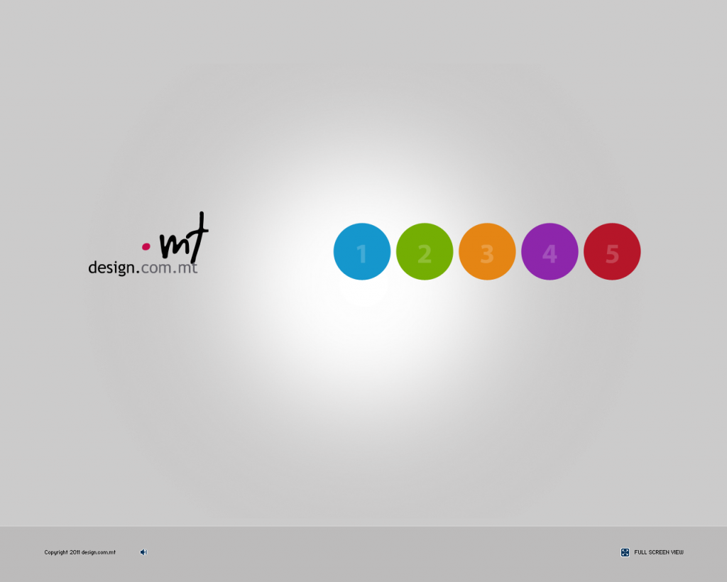
But this, from design.com.mt, is even worse:

This has got to be the worst of them all. Whereas you might be able to somehow guess what the icons in the other sites mean, the navigation here is hidden behind meaningless numbers that you again have to mouse over to understand.
It gets worse: there are videos on YouTube of sites with iconic navigation that actually floats around, so you actually have to find out where that “About Us” cube thingy moved to (examples: Mandarina Duck, Qualcomm).
So why is MMN bad? In case it isn’t obvious, it is very annoying for users to have to click on stuff to figure out what the page offers. A website should give a clear indication of how it is structured, without the user needing to interact with it just to get an idea. Imagine you’re driving and need to interact with a bunch of direction signs (such as these) one by one to get an idea of the places in the area. Then, after sifting through a dozen, you forget what you saw earlier and have to go back and interact with them again. Sorry, the “just a click away” idea is not an excuse when it comes to navigation, which is really a website’s backbone.
Another great example comes from feedback that Vincent Flanders received, and illustrates how MMN would be if applied to a business’s answering machine:
“You’ve reached XYZ Corporation. To find out what option #1 is, press 1. To find out what option #2 is, press 2. (Etc….) If you’d like to continue doing business with our company after we’ve slapped you around and wasted your valuable time, press 9”
MMN is a slap in the face of usability. It shows meaningless icons in the place of important navigational information. What could possibly worse?
The only thing worse than showing meaningless icons is not showing any icons at all! That’s pretty much the direction taken by Windows 8’s notorious alternate UI, formerly known as Metro. One of its design principles is “Do more with less” which includes “Put content before chrome”. In this case the “chrome” refers to the stuff that makes the application – menus, the ‘X’ button at the top-right, toolbars, etc. So basically you end up with something like this:

That’s the default PDF viewer on Windows 8 – one full screen Windows 8 Style (the new name for Metro) app with the PDF content and nothing else, not even an ‘X’ to close it. In fact Windows 8 users are somehow expected to know beforehand (“by osmosis”, as this Windows 8.1 review puts it) that to close a Windows 8 Style app you have to grab it from the top and drag downwards with your mouse. Contrast this with the same PDF viewed on Windows 7:

Needless to say, everything that you can do with a PDF is immediately accessible either from the toolbars or via the menus. There is no hidden stuff, no needing to drag your mouse into a corner to open some Start Screen or Charms Bar. See, the program actually shows you what it can do, and for new users that’s important. The “Content before Chrome” idea is wrong precisely because when you use a program, you want to do stuff, not just see stuff.
So it’s no wonder that Microsoft seems to have made a U-turn on its Windows 8 Style design stuff. If MMN is an example of bad usability, this Windows 8 abomination is an example of… unusability.
