Category Archives: Rants

The Sorry State of The Web: 3 Group Special

It’s been around 15 years since I first came across Web Pages That Suck. Coming from a time when flashy Geocities-style websites were the order of the day, it was a web nitpicker’s paradise. This is where the term Mystery Meat Navigation (which I have written about in the past) was actually invented.

The very premise behind Web Pages That Suck, “learn good web design by looking at bad web design”, is something that has fascinated me back then, and still does to this day (in fact, it is one of the main reasons behind the Sorry State of the Web series).

Today, we will look at a family of related websites (belonging to a single group of companies) which I’m sure would qualify as first class citizens of Web Pages That Suck.

Enter MyKrypto

I first heard about MyKrypto on the radio. The ad described Bitcoin as a currency just like any other – and said that you could produce it! An old version of their website, which I obtained via the Google Web Cache, is along the same lines of the radio ad:

“Malta has the Euro, UK has the Pound and USA has the Dollar, the Internet has the Bitcoin. Bitcoin is digital and produced by computers..start producing money today!!”

While it’s true you can produce Bitcoins, this feels a lot like a scam in that it’s urging people to print their own money (in a way) without telling them about the risk or the difficulty involved in actually mining Bitcoins. In fact, the website also used to say that Bitcoin mining is a secure investment:

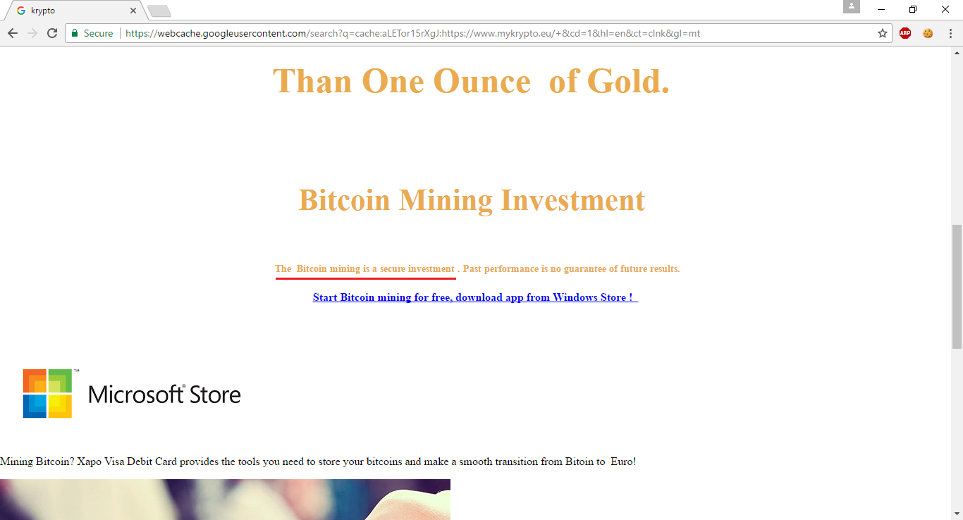
Whether Bitcoin mining is really a secure investment is debatable (although one can get an idea by looking at market crashes that have occurred in the past). In any case, while I’m not a lawyer, I don’t believe a company can legally give investment advice unless it is an authorised financial institution, especially without evaluating the risk portfolio of potential investors.

MyKrypto Home Page

The above selling points were removed, and the site transitioned into a different realm of madness. The site’s homepage had this image with Comic Sans text:

This was eventually replaced by the text image we see today:

Although the text changed, the link behind it remained the same. It’s basically a Google link (notice the URL) that takes you to this Satasoshi graphic on Deviantart:

So, in case it’s not clear, let’s summarise the fails that occur just within that little text image:

  • Using an image to show text with a particular font.
  • Using Comic Sans on what is supposed to be a serious website.
  • Linking to a Google search result rather than to an actual webpage.
  • Completely failing to understand what you’re selling (it’s a Satoshi, not Satasoshi, and the horse has nothing to do with it).

MyKrypto Mining Page

Let’s move over to MyKrypto’s Mining page. It now looks something like this:

While the image is totally out of place – and we’ll get to it – this is on the whole not too bad. Let’s take a look at what the previous version of this page (from just a couple of weeks ago) used to look like:
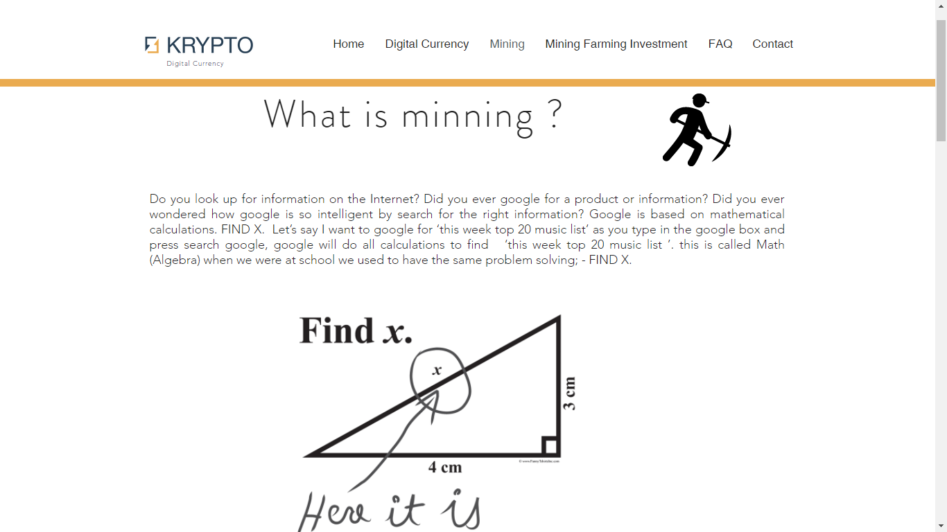
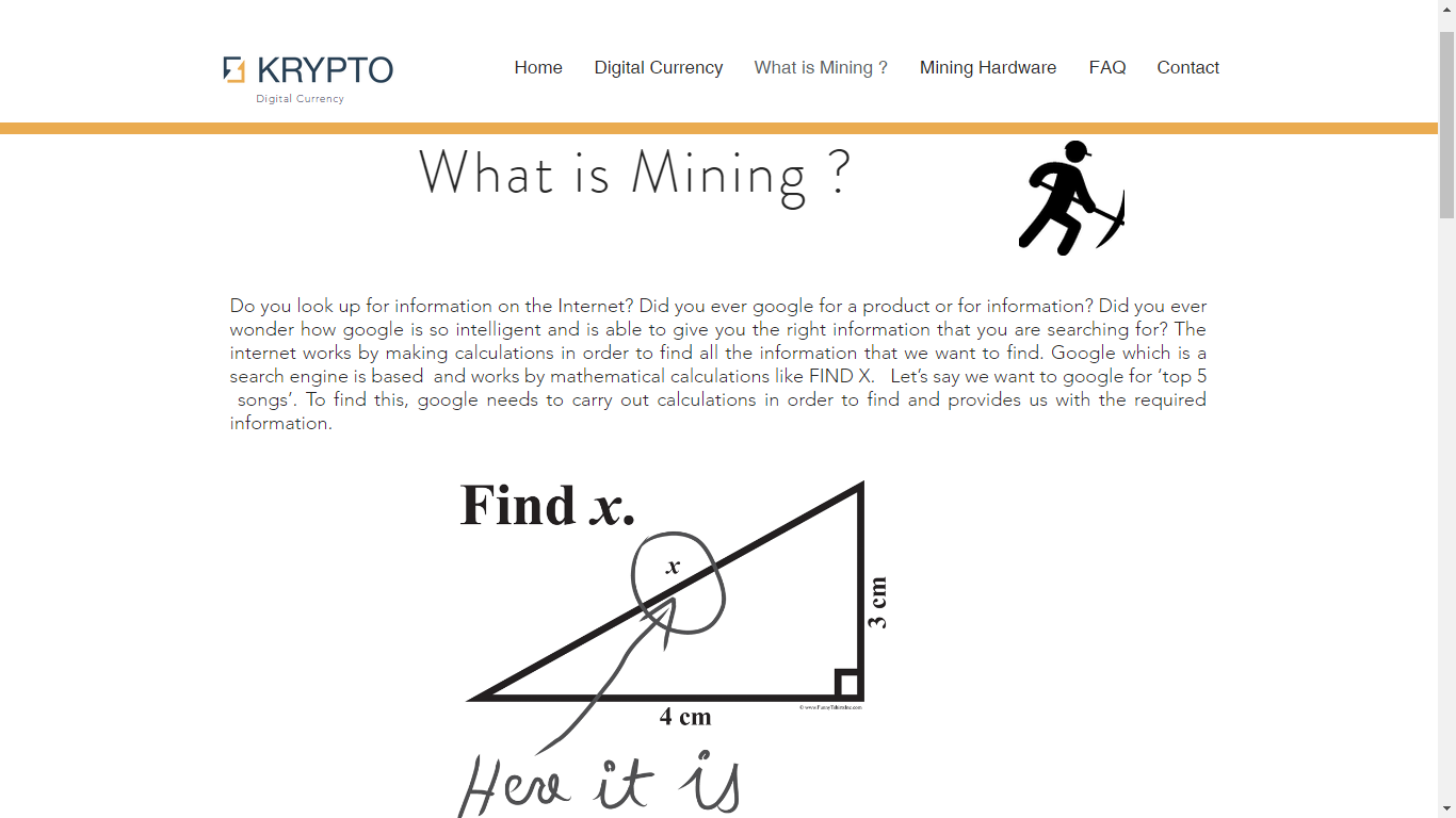
First, the title.

“What is minning?”

I don’t know. Perhaps this lovely lady might be able to answer that.

Image credit: taken from Wikipedia’s Minnie Mouse page

Next, we can take a look at the text.

“Do you look up for information on the internet? Did you ever google for a product or information? Did you ever wondered how google is so intelligent by search for the right information? Google is based on mathematical calculations. FIND X. Let’s say I want to google for ‘this week top 20 music list’ as you type in the google box and press search google, google will do all the calculations to find ‘this week top 20 music list ‘. this is called Math (Algebra) when we were at school we used to have the same problem solving; – FIND X.”

It is simply beyond belief how much crap these guys have managed to fit into a single paragraph. But beyond that, take a look at the image below that paragraph in the screenshot. It’s a popular joke that has been circulating for many years: a clueless student answered a mathematical problem in a witty manner. Of course, whoever built the MyKrypto website didn’t get the joke, and put the image there as an example of mathematics. Go figure.

List of fails in this section:

  • Terrible use of English (if it can be called that).
  • Google does not solve algebraic problems to give you your search results.
  • Don’t lie about what you used to do at school, if you evidently know nothing about English, mathematics, or computing.
  • Try to understand what an image actually means, before ripping it off.
  • Try to understand what you’re talking about in the first place.

MyKrypto Audio

MyKrypto automatically plays audio.

That’s something really annoying, especially if you happen to already be playing music. It’s also of questionable legality depending on whether the site has the right to distribute that music.

Besides, using some cheesy 70s disco background music – reminiscent of Earth, Wind & Fire – is totally not appropriate on a company website.

MyKrypto Mobile

Mobile users will be disappointed to find out that they can’t really browse the entirety of the site because the navigation is simply not available:

MyKrypto Plagiarism

To be fair, messed up paragraphs like the one we saw earlier are a rare sight on this site. In fact, a lot of MyKrypto’s content is blatantly stolen from other websites.

Let’s see some examples:

I think they should plagiarise more. It would make them look a lot less silly.

CEO Plagiarism

Of course, the plagiarism on MyKrypto makes perfect sense if we look at the LinkedIn profile of 3 Group CEO Dario Azzopardi (MyKrypto is part of 3 Group):

When I first read this, I thought it was really weird as a job description. So I Googled part of it.

Google did its algebra (!), and what do you know

…and further down…

3 Group: Questionable Stuff

Having seen all this, I thought it was just as well to check what else 3 Group actually do.

3 Group do IT Services, IPTV, and E-Money. That’s a nice name for the Bitcoin stuff we’ve seen above. They actually got the link wrong, and E-Money points to IPTV.

If we take a look at IT Services, we get to this horrendous page with a background animation driving you nuts while you try to read text with very bad contrast:

Further down that page, 3 Group are trying to convince people that free antiviruses are bad, and that they should instead pay 3 Group to install McAfee for them:

Towards the bottom, you can see some grey text representing a link to Intel’s homepage. Of course, they didn’t bother to actually make it a link that you can just click on. What’s even worse is that the superhero on the left is an image overlaid onto the text where the link is, so you can’t even select and copy it.

Right, what else do 3 Group do? Ah yes, IPTV. It’s interesting how they have this “Legal” page under the IPTV section, claiming that “IPTV is 100% legal”, and quoting some court case from the European Court of Justice.

This is noteworthy because:

  • Naturally, a company encourages trust by stressing that its services are 100% legal.
  • This company knows a lot about copyright, given the aforementioned plagiarism.
  • It claims that “watching streams even those which are illegal is not an act of copyright infringement”. So it’s ok if it’s illegal, as long as it’s not copyright infringement, right?

Well, they say IPTV is legal, so it must be true.

Image credit: taken from here

That’s curious, because I could swear I recently read an article about this Kodi TV streaming service being declared illegal across the EU:

Conclusion

While 3 Group’s web design is appalling at best, this is not nearly as worrying as their questionable business practices. As an exception in this series, I hope not only that web designers/developers learn from the mistakes we have seen here, but also that potential customers do some proper research and understand what these guys are actually trying to sell to them.

The Pitiful State of the Web in May 2017 (Part 2)

This article is a continuation of The Pitiful State of the Web in May 2017 (Part 1) and a part of the Sorry State of the Web series. I and the others who contributed to the content of this series hope that web developers will learn from the mistakes of others and produce better quality websites.

Dakar: Language Issues and Insecure Login

Dakar Software Solutions is a well-known name locally, especially in the realm of payroll systems.

They had this little glitch with the language of dates in the news of their Dakinet product (which might be fixed now):

Also, Dakar joins the long list of websites that offer insecure login:

Insecure Login Galore

As you can imagine, Dakar is not alone in failing to transmit user credentials securely. We’ve seen a lot of these before, and we have a lot more to show here.

For starters, we have Freelance Malta. Since all of the site is based on insecure HTTP, the login form and both registration forms transmit credentials insecurely:

Then we have Gizmodo, the popular tech website:

KeepMePosted is a similar offender:

And then we have MyMoneyBox (part of the MFSA family), which given its name should know better about security. In fact, it seems to have now gone HTTPS, so the login is now secure. But as you can see below, it wasn’t until recently:

Couchsurfing: Invalid SSL Certificate

I recently caught the Couchsurfing blog giving invalid certificate warnings:

Oops. Looks like the certificate had expired.

Needless to say, it is useless to use HTTPS if it is not trusted. Fortunately, this issue has since been fixed.

Malta Police Force: Passwords In Email, Freedom of Information Link

The Malta Police Force website offers a number of services including filing a police report online. At the bottom of the declaration where you’re about to file a report, there’s a link to the Freedom of Information Act:

Unfortunately, it doesn’t work:

That error is actually coming from elsewhere on the government network (looks like it’s the Department of Information). Either the Malta Police Force need to fix their link to point elsewhere, or the DOI needs to fix a problem in their SharePoint system.

There’s something a lot worse, though. Some people have reported that when you file a police report, you choose a password, which is then sent to you via email.

This image was contributed by someone who actually filed a real police report. Aside from various spelling issues in the email, you can see that the password (obfuscated here for obvious reasons) is included.

This is something you always want to avoid because you can never assume that email is a secure channel on which to send sensitive information such as credentials or credit card information. Good practice is to let users choose their password over a secure channel (which the system reportedly already does), store it securely using a one-way hash, and provide the means to reset it using limited-time tokens in case the password is forgotten.

Rizzo Farrugia – Broken Link For New Equity

When new shares under the symbol “PG” were listed on the Malta Stock Exchange, Rizzo Farrugia were quick to add it to their own list:

However, they were not nearly as fast at creating the detail page that the listing links to:

No big deal there. It was fixed the next day.

PWC Refresh Form

PricewaterhouseCoopers has this newsletter signup form. It has a reset button. Something pretty normal, you’d think, until you see that it refreshes the entire page!

Form resetting functionality has been built into browsers since long before I started creating websites (15 years and counting). In this case, I see they wanted to reset the CAPTCHA. But they already have functionality to reset the CAPTCHA without reloading the page (the orange round arrow next to the CAPTCHA), so why reload the whole page just to reset a form?

IDPC: Line Spacing

The Office of the Information and Data Protection Commissioner has a form where you can submit complaints:

What I’d like to call out here is the questionable design choice of using massive line spacing, which is especially noticeable in the Complaint text area since about half of the tiny box is wasted with empty space.

Line Separator Characters

JobsPlus, whose encoding issues we have already visited in “The Broken Web of March 2017“, is now also exhibiting these weird LSEP characters:

It’s okay though. Perhaps they can’t sanitise their data, but they still get to keep their eBusiness Award!

I have also spotted the same problem at Creative Jobs:

Summary

Transmitting credentials insecurely remains one of the most common issues on websites today, and it is completely unacceptable. Depending on the nature of the user account, this might not be as risky as transmitting credit card details insecurely (something we’ve also seen in abundance over the past few months), but that does not relieve websites from their duty as data controllers to transmit sensitive data securely.

It is also important to test websites properly in order to identify broken links and data-related issues as we have seen.

Finally, secure transmission of sensitive data does not stop at using HTTPS. SSL certificates must be integral and trusted, otherwise it is just as good as not having HTTPS. Email is not a secure channel, so don’t use it to send sensitive data, especially if there exist alternative data flows where you don’t have to.

The Pitiful State of the Web in May 2017 (Part 1)

Welcome back to the Sorry State of the Web series! This is a collection of bad stuff found on so-called professional websites, contributed by both myself and others who have submitted entries. It is sad to see so many fundamental mistakes being repeated over and over again, and by calling them out, we hope to promote better quality work in web development, and as a result, a better experience on the web.

Unfortunately, this month we are once again about to see a lot of security-related violations, including insecure login and credit card processing. We will also see a lot of negligence. Thus, without further ado…

Deal: Insecure Login

deal.com.mt, like many other websites we have mentioned and will mention, support registration and login over insecure HTTP:

You will also notice the strangely superimposed text saying “Please log into this app” below the Facebook button. Certainly not an artistic style I would want to imitate.

Careers in Finance: A Different Kind of Education

Careers in Finance, a pathetically designed website that seems to be part of MFSA, has this Warnings page.

The warnings page presumably takes you to a list of unrecognised training institutions. So when you follow the link, you get…

…this. Aside from the error page, you’ll notice a hilarious misspelling of the word “Universities” in the filename. Whoever named the file was evidently alienated by more… interesting stuff at the time.

Microsoft: Runtime Error Page

I noticed a similar runtime error when accessing a webpage on Microsoft’s own website. They could have handled this better.

The Malta Independent: Sneaky Advertising

The Malta Independent had this really invasive ad covering the whole site as you load it:

If you click the link at the top-right of the ad that says “Skip and Visit Site”, you are actually taken to the website that the ad is promoting, rather than just closing the ad and letting you read the online newspaper. What a sneaky way of raising advertising revenue!

If you wanted to just close the ad, you actually had to click the “X” at the top left, which is very easy to miss.

This shameful advertising mechanism seems to be gone now, thankfully.

Mediterranean Bank: Out With the Old, In With The Crap

Last weekend, Mediterranean Bank launched their shiny new internet banking platform, after a whole weekend of planned downtime for the changeover.

Existing users have to undergo a migration process, and this is fraught with flaws.

The first thing you see in this new system is a field requesting a “Client number”. The problem is, nobody has any idea what this client number is. In the old system, we used to use a username and various other fields, but no client number. And sure enough, if you enter something invalid, an error appears, telling you to enter your old username if you are using the new platform for the first time.

That would have been useful to have before you try to login.

After that, you have to enter your surname. So they made a whole webpage just for you to enter your surname (yes, full page reload).

To migrate your account, you have to enter all the stuff you used to have in the old system (understandably, because you have to be authenticated). That includes a secret question:

Now, using secret questions is already arguably very stupid in the first place. But not obfuscating the answer (which the old system did properly, by the way), is just terrible from a security standpoint. Security answers, while not passwords in themselves, are password-like material. You do not want someone looking over your shoulder to be able to read them just because you are typing them in.

Moving on to the less serious and more silly flaws, it seems like Mediterranean Bank have taken inspiration from JobsPlus (see the March issue) and put in a language selector with just English in it:

You can choose between English… and English.

What about that cookie policy at the bottom? They ask you to read their cookie policy, but there is no link. It looks like they just forgot to include it, because their main website (i.e. not the online banking part) has it:

Sport Malta: Insecure All The Way

Sport Malta, another website by Cyberspace Solutions Ltd. (a company well-known to this series – see “Lost in Cyberspace in February 2017“), was caught processing credit cards and login insecurely:

It seems like they now have HTTPS, but it doesn’t quite work because of mixed content:

Poor guys. They can’t seem to get one thing right.

EUROPA: Cobwebs and Such

Like Sport Malta, the website of the European Union has a bit of a mixed content issue that invalidates its HTTPS setup:

So like any good citizen would do, I decided to report the issue. In their contact form, you can specify what browser you’re using. Well, the browser versions in the list are ancient (I was using Chrome 58, and the latest one in their list is 40; likewise, although I was using Firefox 53, I could only choose up to Firefox 34. They even managed to misspell the Konqueror web browser.

Anyway, I reported the HTTPS problem, and also asked them nicely to update the browser versions on the contact page. When you write to them, they tell you that it can take about 3 days for them to get back to you.

And that’s exactly what happened. Today, I received a reply, which said:

“Would you kindly clarify if you are referring to some specific webpages?
You may contact us again in any of the 24 EU official languages via our webform which is available here:
https://europa.eu/european-union/contact/write-to-us_en
This clarification would enable us to forward your message to the relevant department of the European Commission for information purposes.”

So basically, having taken 3 days to reply, these guys didn’t even bother to browse their own website’s homepage. And contacting me back through a no-reply email address, they expect me to fill in that form again, just so that I can tell them what they could already have determined themselves, and then forward it to some department where it would then get lost in a bureaucratic hole.

No thanks.

Spotlancer: Insecure Login

Just more of the same from Spotlancer:

TicketArena: Insecure Credit Card & Login

Be careful where you buy your tickets from! Ticket Arena is served over insecure HTTP, yet it processes credit card info:

…and credentials:

“Your credit Card is 100% Safe and Secure,” they said. “We use the latest standards for security with Comodo,” they said.

Image credit: taken from here

Summary

As I’ve repeated ad nauseam over the past articles, you simply cannot process sensitive data (including passwords and credit card details) over an insecure channel. It doesn’t matter if you’re using an HTTPS iframe inside an insecure HTTP-served page. It’s simply not enough.

Websites also need to be tested better. Several websites that we have seen in this article have various problems of different severity levels that could have easily been caught earlier with a little more attention.

We’ll see more issues along these lines in Part 2. In the meantime, I would like to thank all those who sent reports for entries that were included in this article, and I welcome submissions for the June issue.

The Shameful Web of April 2017 (Part 2)

This article is a continuation of The Shameful Web of April 2017 (Part 1) and a part of the Sorry State of the Web series, in which I and various contributors show various blunders in supposedly professionally made websites in order to promote a better web.

The Hive: Mixed Content

At the time of writing this article, The Hive still has an issue with its HTTPS connectivity in that it is considered insecure because it’s using a resource that isn’t coming over HTTPS.

If you want your site to be served over HTTPS, then any images, scripts, and any other resources that it uses must also be served over HTTPS.

Malta Stock Exchange: Content Should Come First

Think of this: if I trade on the stock exchange, I would like to be able to see stock and share prices quickly.

So let’s go to the Malta Stock Exchange website:

(By the way, until a few days ago, there was a nice big photo of Fort St. Angelo instead of this Latest News section. It still gets in the way of finding the information you want, but it looked a lot more silly with a nice picture of the Fort, and I wish I had grabbed a screenshot back then.)

Now, we have to scroll halfway down the page:

Then, we need to expand “Regular Market”…

…and finally, we can see the prices we were looking for. Unfortunately, this is not very intuitive if you’re visiting the site for the first time, and it is a real pain in the ass to have to do this every time you want to check the share/stock prices. This is the information that people want to see most of the time, and it should be the first thing presented on the site, not buried somewhere far down the page.

There is nothing intrinsically ‘wrong’ with this in the sense of many other serious flaws that I usually write about in these articles. However, from a usability point of view, it really sucks.

MTA: Load Times and Insecure Login

The Malta Tourism Authority website is a terrible failure in terms of load time: it usually takes over 20 seconds to load.

As if that wasn’t enough, it offers an insecure login facility, which you’ll know to be a serious Data Protection violation if you’ve read previous articles in this series.

Olimpus Music: Insecure Login

Another offender in the category of insecure logins is Olimpus Music.

Basically, don’t use their online checkout facility until they use an encrypted connection.

Owner’s Best – A Real Mess

In “The Broken Web of March 2017 “, we covered some issues with the Owner’s Best website. I see they still haven’t fixed the “Error : Rows Not Set” bug that you can still see if you scroll to the bottom of the page, and neither did they fix the property detail links scrolling down to the contact form and confusing people as a result.

But there’s more. And worse.

For starters, they have a “Property TV” link in the navigation.

Sounds interesting! Let’s see what it does.

Boom. Dead link.

Okay. Let’s try searching for something from the homepage. Oops, I forgot to enter a budget – my bad.

But what the hell is this Fulcrum Alert? And what is wrong with the close buttom? That was a rhetorical question actually. Image 404s in console:

Oh dear. Okay. Let’s put in a budget then.

I put in 10,000. Hey, I’m broke. Obviously, nothing matched, and I got a sad message saying “None properties found”. Yes, you has very good England.

Now I put in a budget of 10 million. That means that I’m super rich, and I’m ready to spend anything up to 10 million on a single property. I got 3 results. Wow. These guys must deal in some real luxury stuff. In fact, two of the results are over budget.

The above search results are based on a 5-million-Euro budget. It gave me this one 4.3-million-Euro bungalow in Dingli. Why didn’t I get this when I searched with 10 million Euros as a budget? 4.3 million is less than 10 million, right?

Now I searched with a budget of 100,000 Euros. Not only do we get all these nice results that would have fitted quite nicely within the several-million-Euro budgets we pretended to have earlier, but we also get properties that are beyond budget, like the one at the top right and the one at the bottom right.

In summary, let’s just say that the search functionality at the Owner’s Best website works in mysterious ways, whether that is intentional or not.

Seasus – Insecure Login

Let’s welcome Seasus among the ranks of the websites that offer an insecure login form:

It is touching to see how much they care about their clients.

Something Different – Various Issues

Let’s take a look at Something Different, a website by Untangled Media (we’ve covered some more of their work in the past).

First, they accept credit card details over an insecure connection. That’s bad. Very bad.

Of course, the credit card iframe itself uses HTTPS, but it’s an HTTPS iframe embeded in an HTTP page, which is still insecure (and illegal – see “The Sorry State of the Web in 2016“), and there is no padlock icon necessary to provide the user with the trust guarantees s/he needs in order to give out his/her sensitive information on the web.

Login is also served insecurely, as you can see above.

We can see another instance of this, as well a lack of a lot of basic validation, in the user registration process:

As you can see above, you can fill in bogus data for most fields. There isn’t even a simple check on the structure of the email address.

In the second step of user registration, you choose a password. Insecurely, of course.

And that’s it! Congratulations for registering your invalid account insecurely!

In this section, we took a look at Something Different. Or rather, more of the same.

Untangled Media / Winit

In Untangled Media‘s Web Publishing section, you’ll find references to various sites including Something Different (see previous section) and something called winit.com.mt:

As they say in the summary, “Everybody loves winning things.” So do I! Let’s follow the link and check out the site.

Oops. Let’s try going to the root of the domain instead.

Win it indeed! It’s more like Untangled Media have lost it.

Summary

April has been a very busy month for spotting issues on websites. We’ve seen a lot of serious security flaws (e.g. insecure login and credit card processing) that have been covered extensively throughout this series.

However, we’ve also spotted a number of issues including high loading times (on one occasion due to the use of large images without thumbnails) and various usability problems. Always keep in mind that websites need to deliver information (whether to sell or otherwise), and thus, information needs to be delivered in a timely, clear, and intuitive manner.

Let’s hope that this article makes some people chuckle, and makes others do a better job of building websites!

Thanks for reading, and stay tuned for the May edition of The Sorry State of the Web! If you find any issue that you would like to include in this series, we would love to hear about it.

The Shameful Web of April 2017 (Part 1)

This article is part of the Sorry State of the Web series, which aims to raise awareness about common and fundamental issues in supposedly professional websites in order to push web developers and designers to raise the bar and deliver at least decent user experience. Since a lot of issues were noted in April 2017, the April issue will be split into two parts. I would like to thank those readers of Gigi Labs who contributed several of the entries in this article.

JobsPlus Receives e-Business Award

In the March 2017 issue of the Sorry State of the Web series, I had pointed out some really basic flaws in the JobsPlus website. That didn’t keep it from receiving an award for “best technology in the e-Government sector”.

Image credit: taken from here

Facebook’s Intrusive Login Prompt

If you view a video on Facebook and you aren’t logged in, you get this login prompt that practically takes up the entire window:

There’s a tiny “Not Now” link at the bottom that you can click. This doesn’t actually remove the prompt, but makes it smaller and moves it to the bottom:

Unfortunately, there seems to be no way to close it, and it still takes up a significant portion of the screen, especially if you are on a laptop. Not very nice!

Don’t Send Passwords via Email

I got this email from a web hosting company:

They never learn. You should never send passwords via email. There is absolutely no guarantee that emails are transmitted via secure channels, so you should assume that it is insecure by default. Instead, let the user choose a password on your website, when the content is served over HTTPS.

Links Should Actually Work

We all know how annoying broken links are, but RightBrain have found a way to match that frustration using links that actually work:

The social media icons at the bottom-right actually point to the website’s homepage, rather than to the social media portrayed by the icons.

It’s not enough that links aren’t broken. Make sure they actually go to the right place!

Microsoft .NET Core Documentation

If you want to learn a little C#‎ (whatever that is supposed to mean), you’re in luck. Microsoft has some tutorials about it:

Seriously though, the .NET Core documentation had some funny HTML entities running around in its sidebar, as you can see above. Very careless, but it looks like they’ve noticed, because this has now been fixed.

Another area where .NET Core documentation is still lacking is in printer-friendliness:

I have written in the past how making webpages printer-friendly is really easy yet very often overlooked. In fact, in the example above, you get around 10 pages of printed content, and the rest of 67 pages which are blank. I have raised this with Microsoft. It seems to be fixed in some browsers (e.g. Edge), and mitigated in Chrome. It’s no longer 67 pages, but at the time of writing this article, you still get quite a few blanks.

Finally, I noticed an issue with their HTTPS. As you can see, you don’t get the padlock indicating that the connection is properly encrypted:

Apparently it’s due to mixed content:

This only happened to me using Firefox on Linux though.

Dear Steve

High up on the list of biggest fails ever in this series is the MySmile dental clinic. There is this contact page with instructions from the dental clinic to a certain “Steve” (presumably from Just Some Coding Ltd, who developed the website) on improvements to make:

Although some pages and links seem to have been renamed, the old “Contact” page shown above is still online!

In any case, Steve didn’t really give a shit, because the map point that he was asked to change still points to the exact same place.

Language Confusion

Unlike JobsPlus, DR Gaming Technology‘s website is really multilingual. In fact, it supports so many languages that one of the language flags actually ended up sitting over the search box:

Despite the language selection, The Latest News box to the right includes many languages at the same time, including English, German and Spanish:

Timely CORS Issue

A friend noted that one of the fonts (Times New Roman) used on the login form of Timely (a web app that I love to hate) looked very out of place.

In fact, the developers never intended to use Times New Roman. They wanted a font called Avenir, but the browser defaulted to Times New Roman due to a CORS issue:

Timely fixed this issue within hours, but it wasn’t timely enough to keep me from taking screenshots.

Use Thumbnails

On some articles at Forbes, the images take ages to load. For instance:

What is more depressing than the job ads mentioned in the article? The fact that the image embedded in that page is actually a really large image:

It should be common knowledge now, in 2017, that you should embed a small version of the image (a thumbnail), and link to a larger version. This way, the image won’t impact page loading time, but the people who want to see the detail can opt to do so. This is especially important in galleries with lots of images.

To Be Continued…

More to follow in Part 2.